 3 / S C
When I first saw the branding work Collins did for Next Insurance on Brand New, I couldn’t help but hit the brakes and take a closer look. The brand language of traditional businesses is getting overhauled by the startup sans-serifization. This work pushes it farther than that, albeit in a very good way.
All images in this post are properties of Collins and Next Insurance. We are not associated with either parties.
At 3 Sided Coin, we’re big fans of what Collins pulled off. This kind of anti-thesis to the Humans of Flat is what we strive for — and it serves as a reminder and reference point that exist in designing illustrations.
So, one day, we decided to crack the code on why their website visuals work so darn well. What follows is my fun attempt at decoding the magic that happens when their visual style elements come together. No lab coats involved, promise!
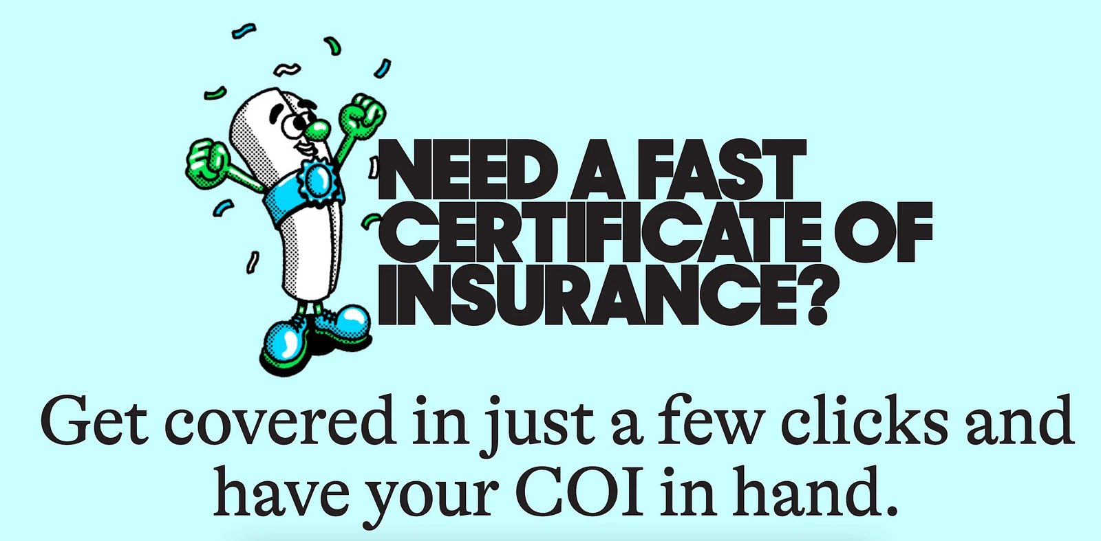 next insurance hero section
Shapes as leitmotifs
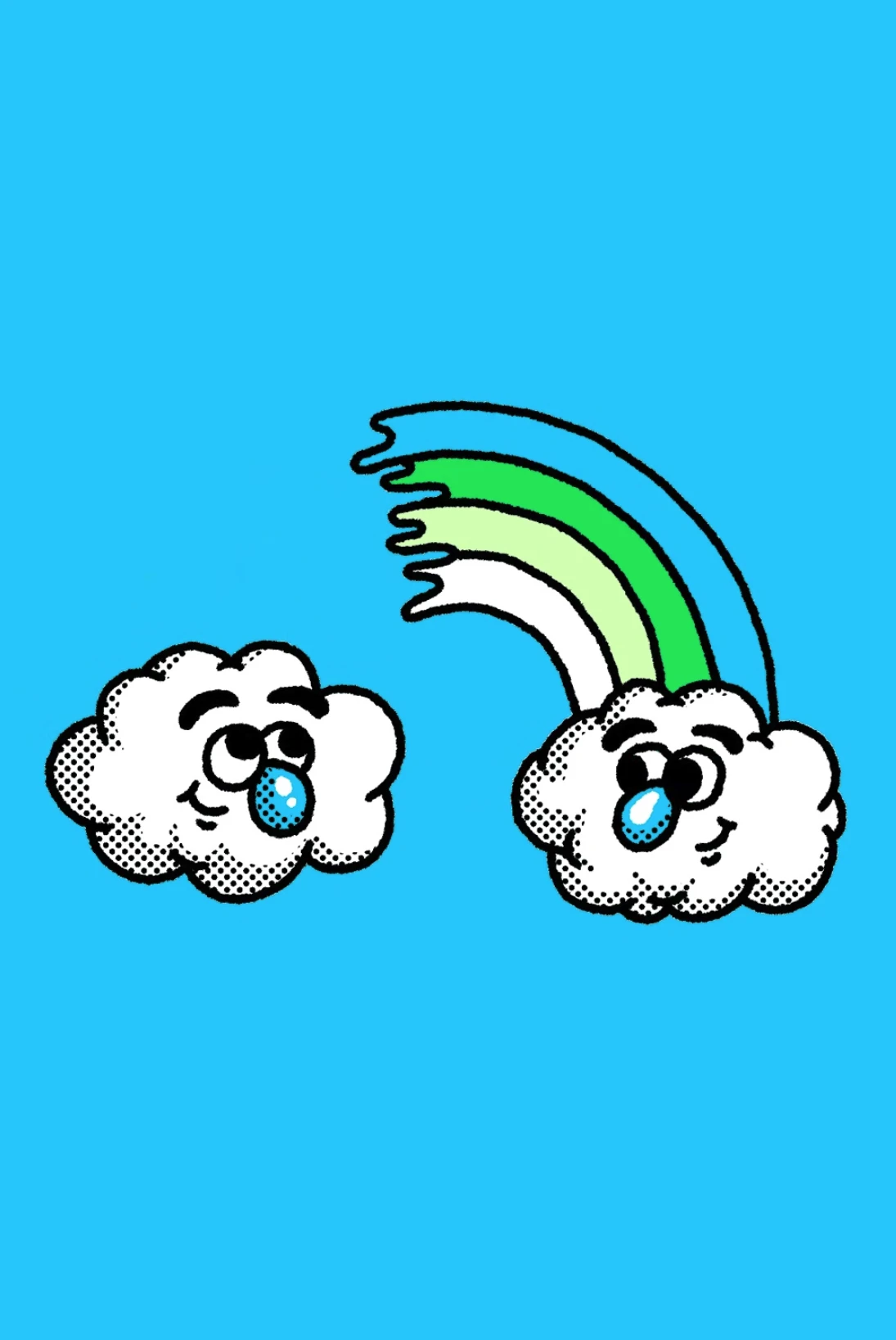
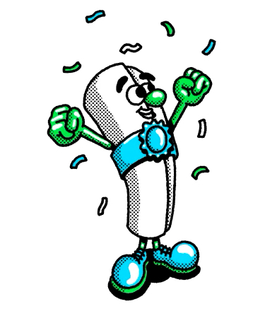
Circle plays huge role in this visual language. Collins imagines insurance policy as a character.
The bulbous toes; the roundness of nose, fingers, and eyes, and eyebrows - the repeated use of basic shape builds character. The body is a cylindrical, subverted into an anthropomorphic shape.
Reflecting motifs in typography
Now, see the heading again in context of the previous rule.
 perfect rounded letters in geometric sans-serif
Sharp Sans by Sharp Type, the geometric sans-serif, replicates the leitmotif in near perfect circles in C, D, and R.
Why stop when you are having fun?
Rounded buttons, and even more rounded glyphs - G, Q. And obviously the o-(type)face.
 repeated appearance of the circular shapes helps create cohesive visual identity rooted in the shape
mind = 🤯
This one is the most eyes-wide-open realisation for me.
 GT alpina’s serifs add a balance to sans-serif and graphics yet keeping a light-hearted way
Zoom into the serif typeface, GT Alphina by Grilli Type & notice how the terminals of 'c', 'a', 'j', 'r' repeat the same rounded shape.
Bringing it all together
It helps that the visual language is focused.
the visual design lets typography and graphics do the heavy-lifting while using a limited colour palette.
They’ve nailed it by sticking to a small range of blue shades in strategic spots. This keeps the design sleek, chic, and fun, without going overboard. The vibe takes us back to the good ol' days of comic books when they rocked bold stories with just a handful of colors.
We are not associated with Collins or Next Insurance. This is us fanhumaning (what’s the gender neutral term for fangirling?) over something that made us sit up and notice.