Written in collaboration with Tanya George, this article was originally posted on Medium.
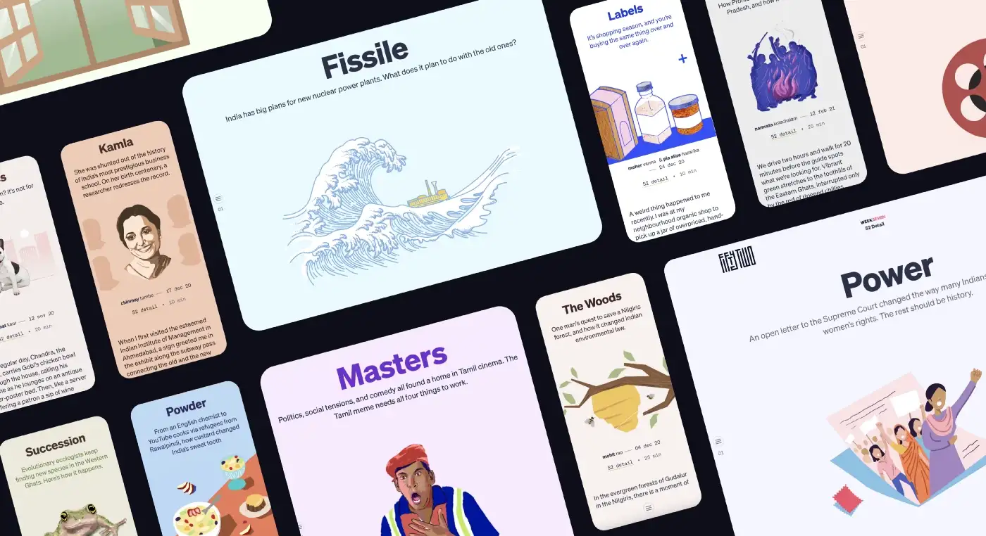
The adjective long-form has a fluid definition for FiftyTwo. The shortest long-form article would be 6,000 words, while the upper limit could be as long as…you’d better sit down for this…30,000 words. A throwback to the heydays of magazines and supplements where one would indulgently spend time with the editorials, FiftyTwo aimed to modernize a classic, in-depth journalism and writing style.
We expected a cosmopolitan reader to interact with the text for extended periods of time and needed to create a typographic language that would build a rich and distinct hierarchy of titles, headings, body copy, captions, and a host of other text levels. For a publication like this — but in effect, for pretty much everything we do — selecting typefaces is the most critical step in the process.
We started with some strong opinions about the body copy typeface and evolved the palette from there. How we chose Literata for the body copy deserves a post of its own but this story here is about the supporting cast. A sans-serif for headings and supporting text. We were looking for something neutral but could spring a surprise or two.
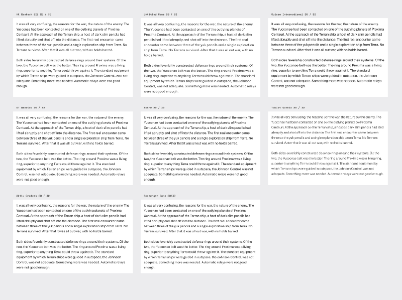
The first round was a long list of our favorites across foundries as well as licensing models.
Design considerations
Our first step to selecting a typeface is figuring out what size it was going to be used at. Over the years, the standard body copy size has changed from 13px to 14px to 16px. The last few years have seen this size increase even further, with screens becoming better. Medium uses a base-size of 21px. We were searching for a Sans intended for Headlines but also the opening paragraph of the body copy text. We stayed at 20px for our base size, at a line-height of 32px (1.6) to sit well on our 8px vertical baseline, with a max-width set to keep the line-width to a comfortable 72 characters. To meet the needs of long-form reading, the 20px selection for body-copy seemed like the most comfortable number without either straining or overwhelming the readers.
Here is the first list of candidates, including both commercial and libre typefaces.
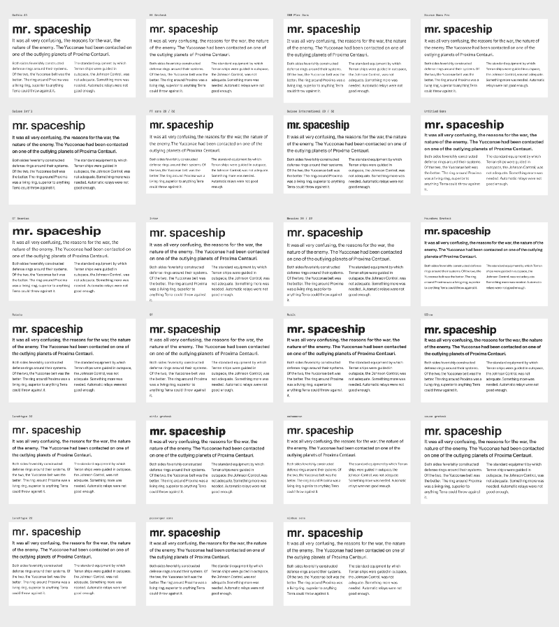
Our initial long list would have been even longer, but for a lack of demo fonts eliminated quite a few favorites before they could even compete. Some of our key considerations in this list were:
- typefaces with similar / closer font metrics, and those that create closer line lengths.
- good x-height — For the web, it is useful to compare the x-heights of letters. In general, taller x-heights mean better legibility. But one has to be sure that the x-height also has a discernible difference from the cap height (check Anybody by ETC for example).
- lightness — how light or heavy a typeface appears on screen might differ from one to another even at the same font-weight specification. For a decent volume of text, this accumulates to become a decisive factor.

With these criteria, we started eliminating some candidates. Messina had a heavier Regular/Book weight, which if not used judiciously, would make the page look heavier. This was not a commitment we could make at this point. Suisse Int’l looked heavier at the same weight compared with the much lighter Untitled Sans.
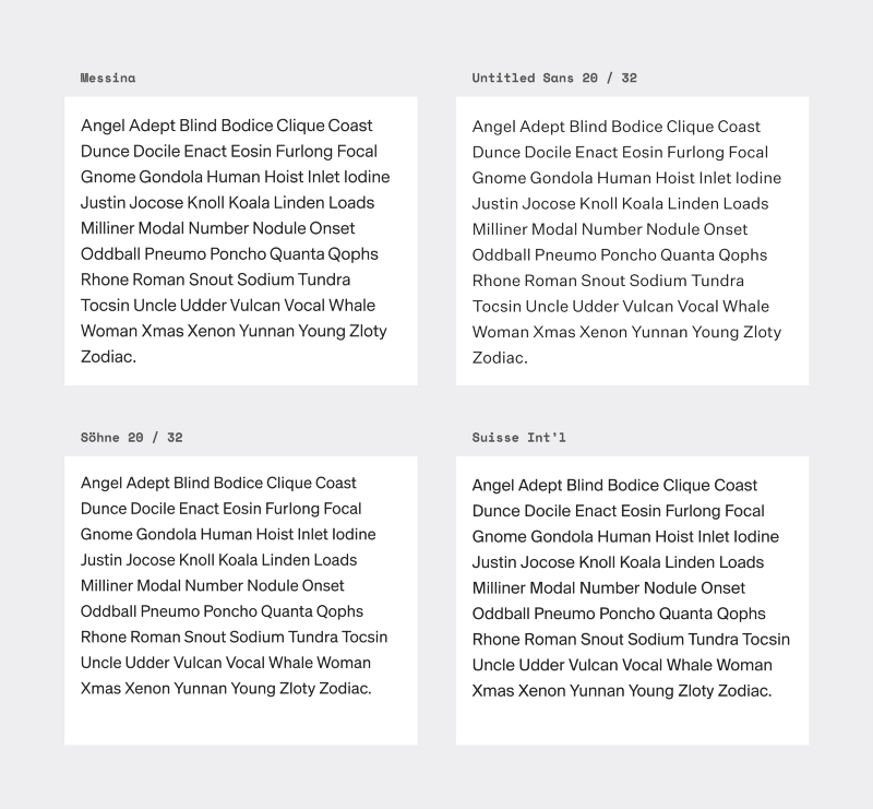 (clockwise) Messina, Untitled Sans, Suisse, Söhne
We also had to let go of the crowd-favorite and a beautiful sans, Founders Grotesk. Its smaller x-height and closed counters would ensure great performance at large sizes for our headings but its position as a supporting body copy actor was doubtful.
After using intellectualization to sift through our initial choices, we followed it up with a majoritarian technique of “ayes and nays” to see which typefaces spoke to the brand values. This helped us filter our initial set of 30 typefaces down to a handful.
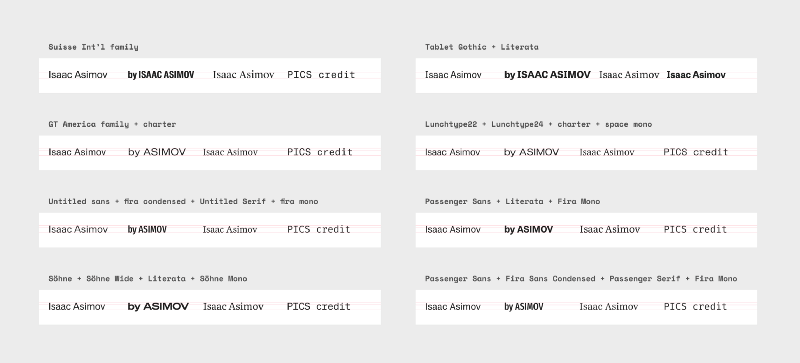
We were carrying the same exercise for our serif candidates also. That selection had reached a similar point and we ran a comparison between the sans-serif and serif. This round helped eliminate choices from both our sans and serifs.
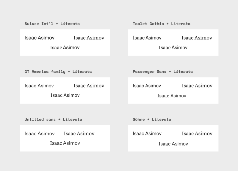
Literata was emerging as a winner in the race for serifs. A gorgeous typeface by TypeTogether that works well at body text sizes and comes with a plethora of open-type features that are suited perfectly for a publication. So we started testing it alongside our shortlisted Sans typefaces.
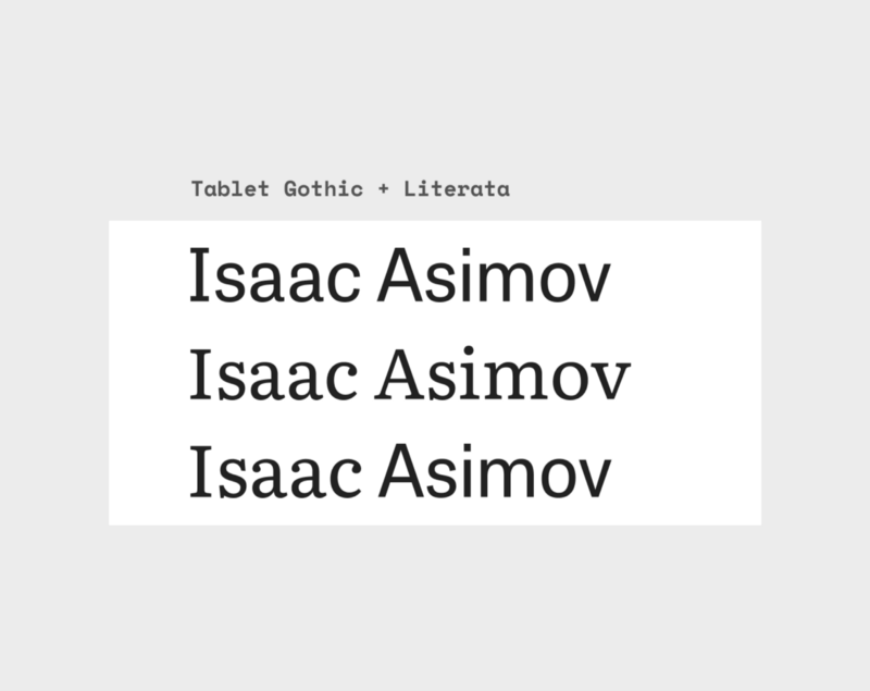
Tablet Gothic was extremely close to getting picked. Not only does it originate from the same foundry as Literata, it also shares metrics such as x-height. While we were considering the combination we realized that selecting typefaces closer in characteristics could also be a double-edged sword. We might actually lose out on any distinctiveness which at this point was important for us to maintain. Nevertheless, we’ve earmarked this combination and look forward to using it in a future project.
Realities of a choice
The only time designers, typographers, brand enthusiasts talk about typeface pricing and licensing costs is when large companies like Netflix, Google, Apple, or Samsung develop an in-house typeface of their own. But this is something that affects smaller players as well.
Our original roster was a good mix of both free/open-source and commercial typefaces. We strongly believe that good typefaces cost. At the same time, the reality is that most typefaces are priced for Western markets. And their EULA’s often read like rocket science.
Only Indian Type Foundry (understandably) had prices somewhat targeted to the Indian market in all the typefaces we had tested. Additionally, some really great foundries still do not provide demo fonts even in 2020**. Literata was intentionally an Open Source selection, but even to test some other typefaces, we had to rent it on Fontstand whose model again feels like it’s priced for a very different audience. This unavailability of Demo fonts meant we couldn’t try Scto Grotesk and quite a few other worthy candidates on an as-needed or as-desired basis.
Maybe it’s just the shock value of seeing things priced in a currency with a terrible conversion rate but this was a huge psychological barrier.
To do a cost-benefit analysis we created a spreadsheet comparing prices at a similar number of page views. Our original estimate for FiftyTwo was 250,000 views per month.

You might notice that page-views in the above table vary to accommodate the nearest slab available from a particular foundry. As it is obvious, certain typefaces are way more expensive than others. I am certain they’re justified in their decision to price their typefaces in the way they deem right, but from the outside, the difference is huge for whatever upper hand they might offer.
This spreadsheet sent us on a detour to look for more alternatives (around 28 including a lot of Helvetica clones, but who’s counting!) to this selection that might be budget-friendly. While some new suggestions came close to being considered we emerged from this process with a leaner spreadsheet than the one we had started. We would like to think of it as us leaving no stone unturned.
So here we have a few of the most well-designed, and popular typefaces out there. We have Suisse International by Swiss foundry. A beautiful typeface that’s a real workhorse, and surprisingly well-priced. On the higher end of the pricing spectrum was GT America — another great type, but a bit overused now (GT America was employed very well in the recent The Ken redesign). That was the same reason that ruled out Tiempos in the body copy department. GT America also felt a little plain, like a lot of American sans-serifs.
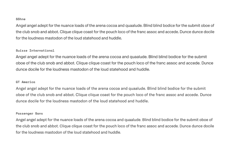
Ultimately we picked Söhne as our sans-serif typeface. Though it is in the higher price bracket, we felt that it will be worth the spend with the edge it will give to the visual language in the long run.

Söhne is an interpretation of Akzidenz Grotesk, which itself is an ancestor to what we know today as Helvetica. Some design notes go beyond just trying to sell the typeface and notes on the Klim website mirror the quality of design that Söhne exhibits —
Söhne is the memory of Akzidenz-Grotesk framed through the reality of Helvetica.
Despite being heavily inspired by two iconic landmarks of modern typography, Söhne adds a lot of quirks that may not be picked by untrained eyes (as it should be) but would register differently than Helvetica and its numerous revivals seen everywhere.
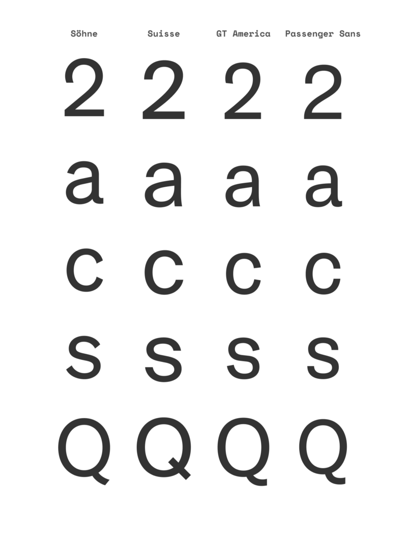
How could we have resisted the Söhne charm — its letter 2 with an understated playfulness. The confident use of angled terminals gave it an open and friendly quality best seen in the lowercase c and s. While others might give you a firm hand-shake; Söhne is a hugger. This warm approachability was missing in our other penultimate choices — we never stood a chance.
So yes, Söhne it was. By the time the FiftyTwo website went live, Stripe and Medium two prominent website redesigns were released with Söhne in their arsenal. It’s both a compliment as well as a disappointment. We are definitely not the first team to use Söhne in their work. That thought is laughable. Among our own design circle, we would love the limelight by being Söhne-selectors. 😉
Yet, it’s a validation of our effort and selection, so no complaints.
*This post owes a lot to Frank Chimero’s own explorations as documented_ here. You might even find some of our jumping-off points and criteria mimicking Frank’s. While our methods are inspired by and results are close to Frank’s, once we understood the madness we have done original research that was more informed by our goals and limitations. We take a solemn oath by Söhne!
**An earlier version of this story included TypeTogether with the foundries that do not provide demo fonts. We were misinformed. They do provide demo fonts with a test license (yay)!
Tanya George — a fantastic type designer, and an accomplished writer — helped us write this article. Her contribution to this post exceeds that of our own, and without her help, you would be reading a much lesser version of this.
 3 / S C
