 Go to Fox Pass home
And we are going to fix that.
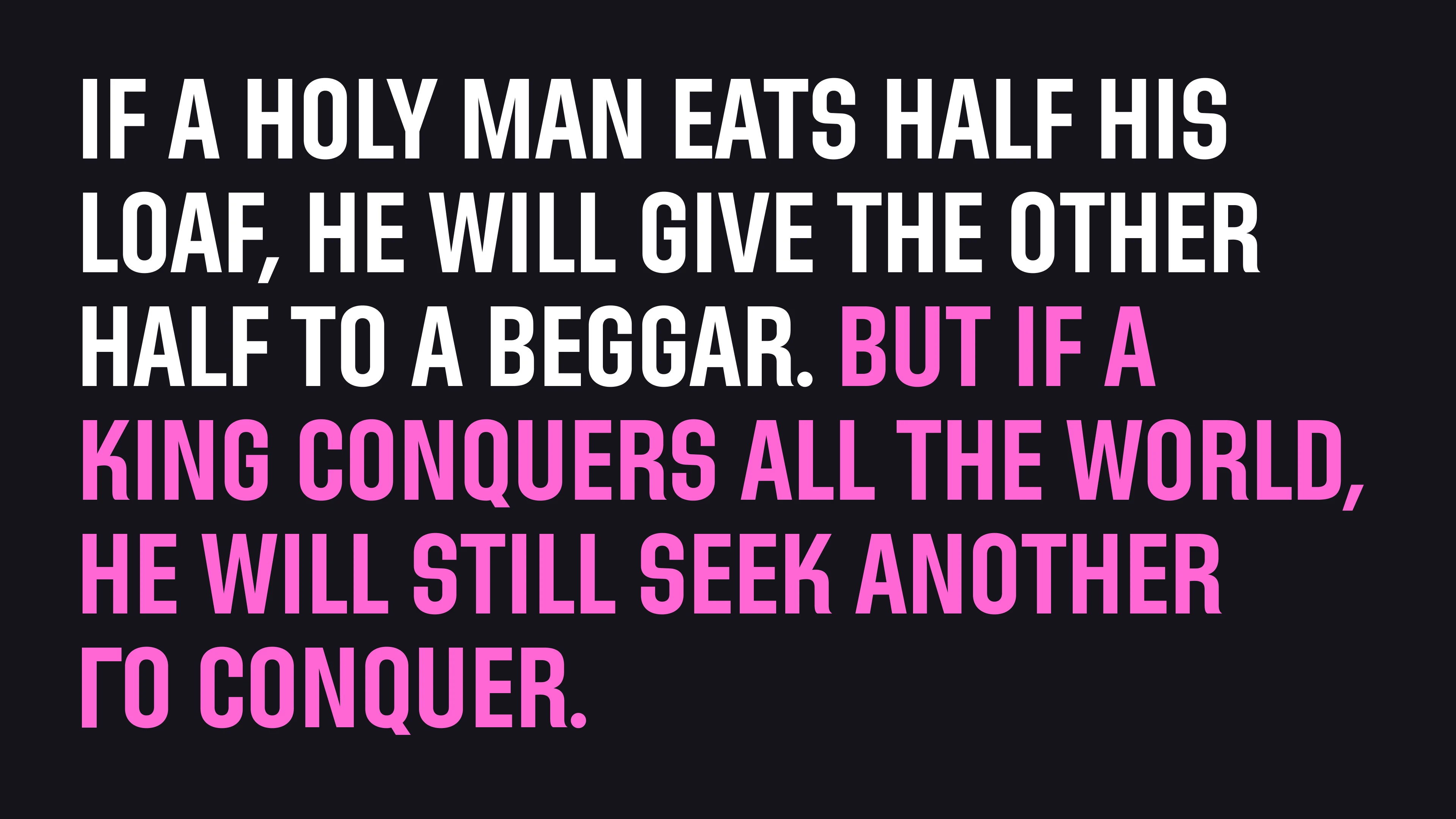
Let’s take this quote in Director’s Gothic 250.
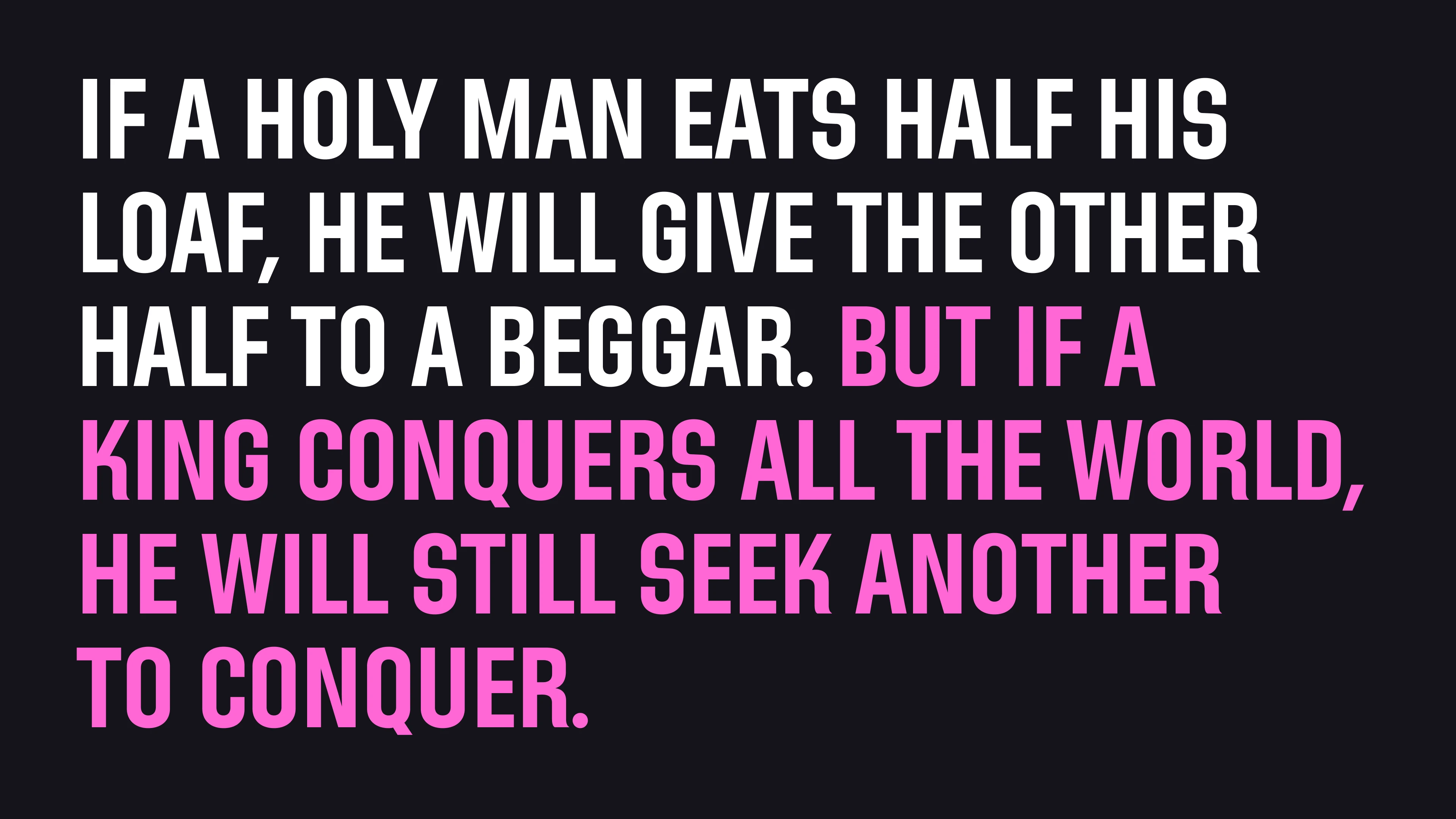 by Persian poet Saadi, captured by Abraham Eraly in “The Age of Wrath: A History of the Delhi Sultanate”
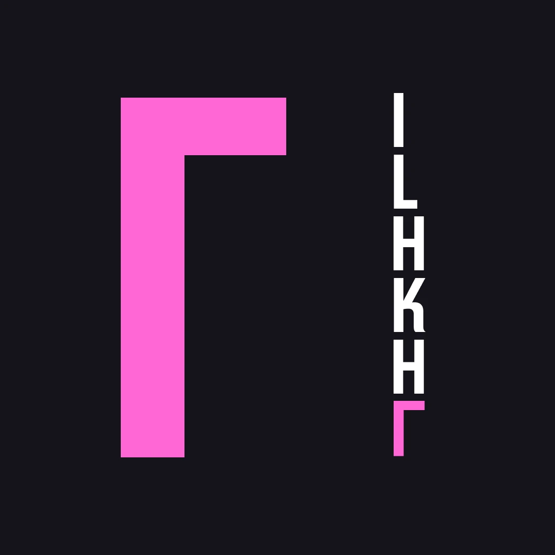
Let’s zoom into the first letters.
All the other letters with an upright bar align well.*
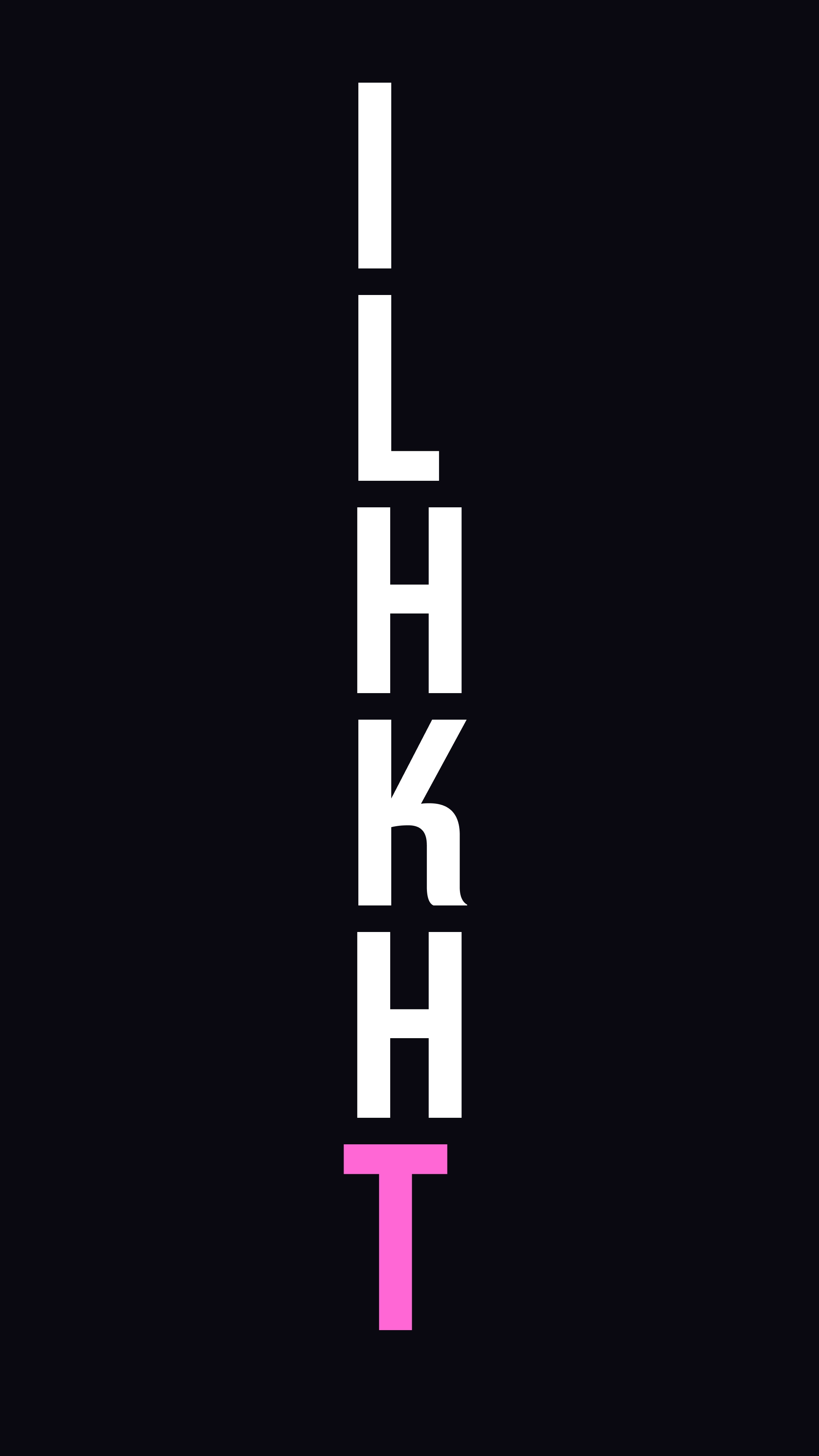
Except that ruffian T.
Designers have started to deal with this stubbornness of T in their own ways.
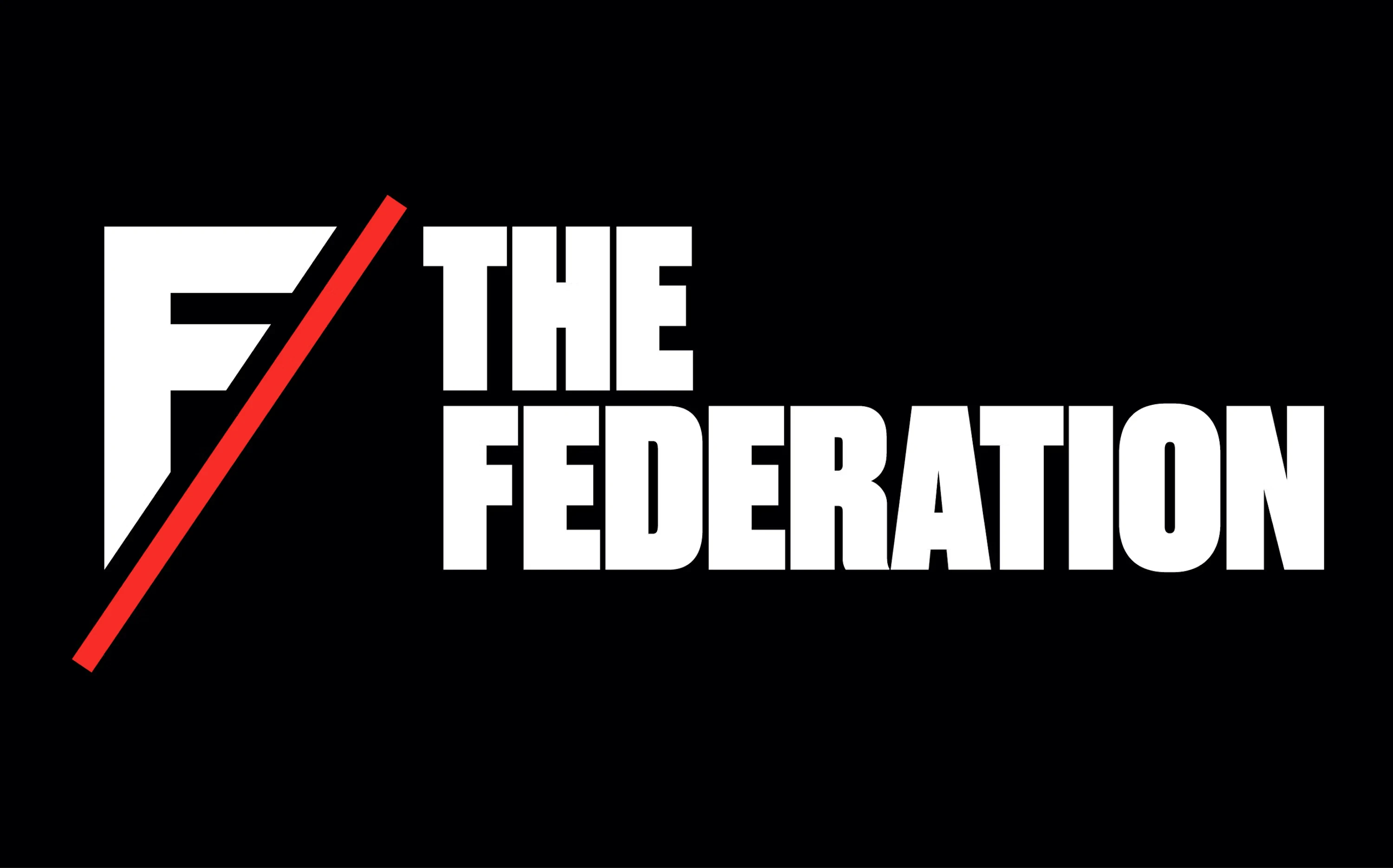
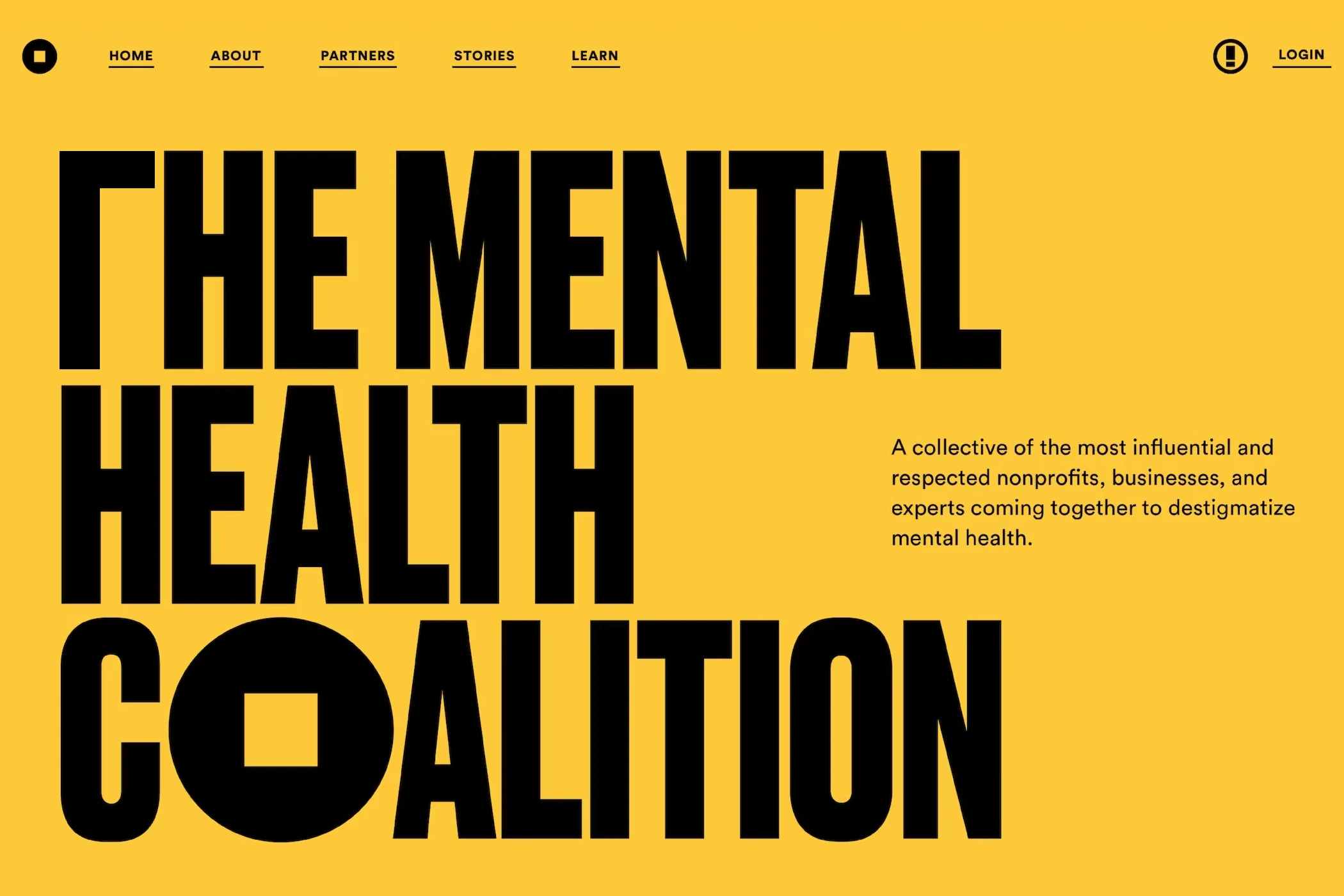
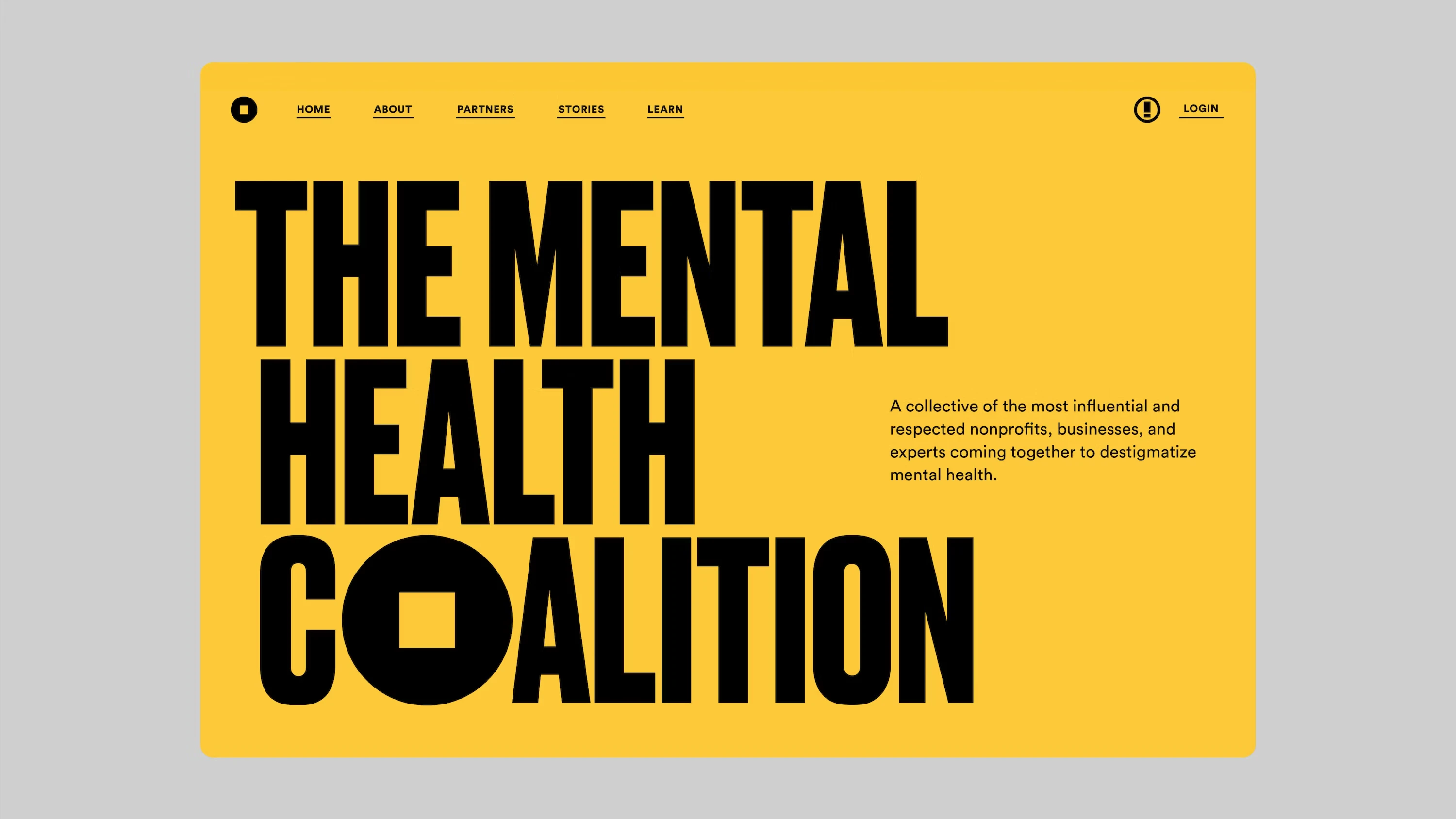 The Federation and Mental Health Coalition (by Pentagram)
In these examples, Pentagram lets the horizontal bar of 'T' hang a little bit like punctuation to align the vertical bar with those from other letters by adding a little bit of outdent.
But we need a more radical solution for this.
Presenting….the new and improved capital letter T.
No more misaligned letters, no more manually outdenting your text to achieve a more harmonious block of text.
There, you have it. You can name this new letter after me. Or not. I have never been one for fame.
*Y - you are next.
Fin.