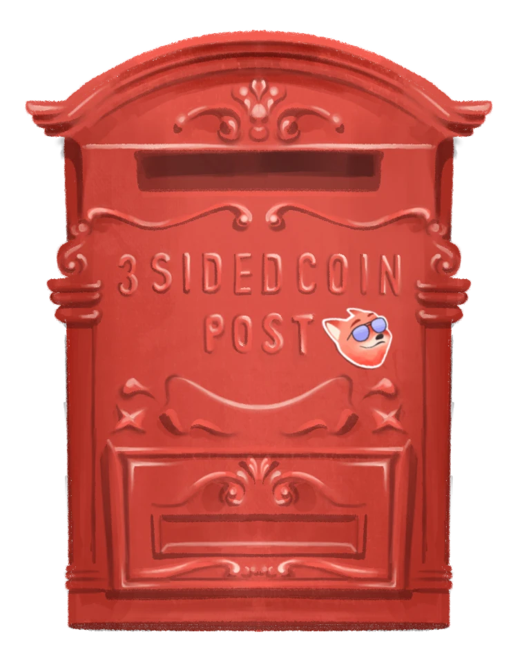
Monospace fonts, born from the era of typewriters, where each character claimed equal space on paper, exude a charmingly retro aesthetic.
Encountered ubiquitously, from editorial designs to websites, coding, video games, bills, and beyond, mono typefaces often serve to introduce contrast when paired with proportional types. In other instances, they take on the role of the lead character, driving the entire design language.
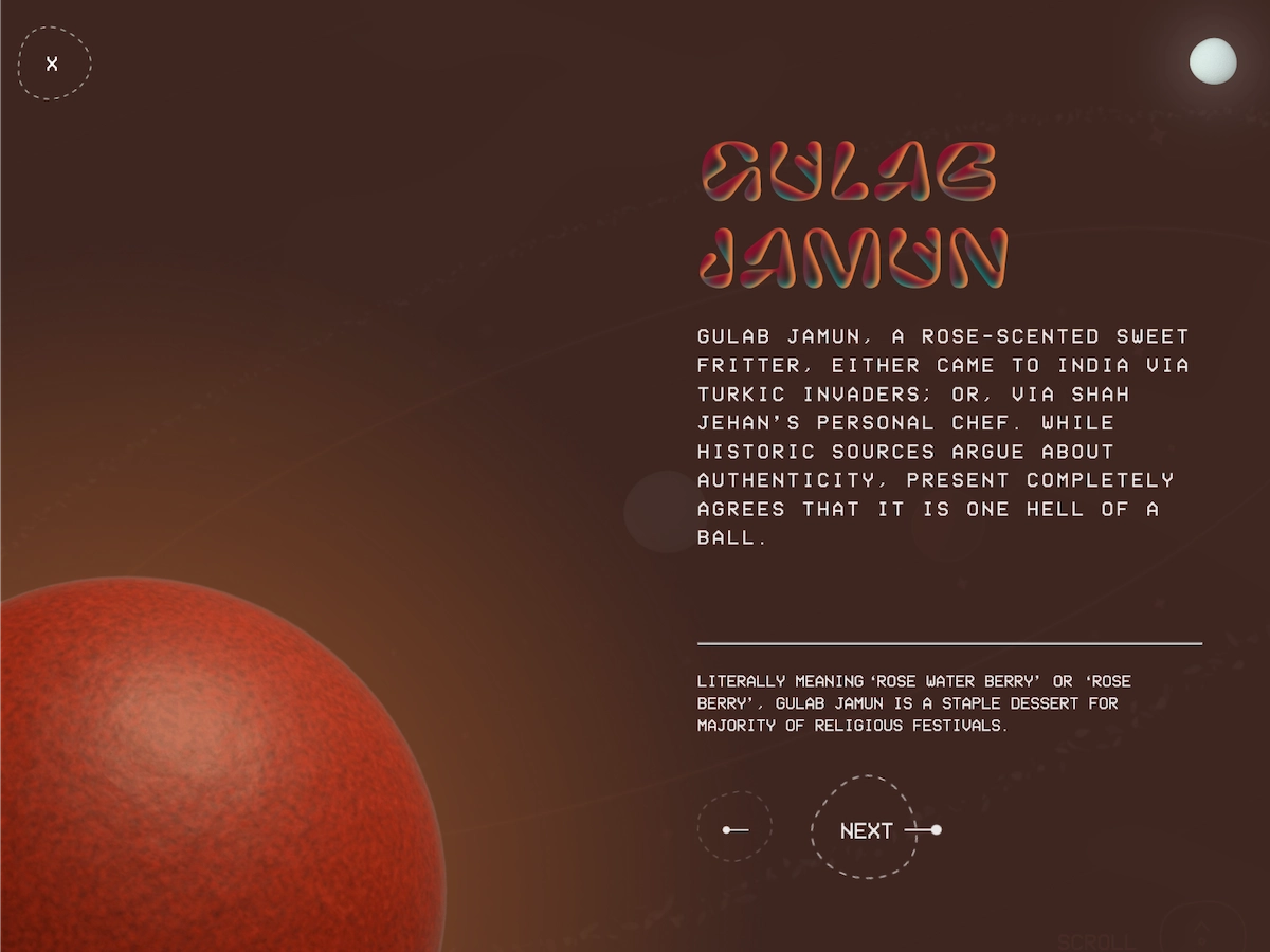 VCR OSD Mono complements the cosmic vibes in the latest edition of Dessert Roz
Regardless of the format, it’s evident that monospace fonts have transcended their origins of being merely “utilitarian and sturdy”.
My fascination with monospace fonts began while designing the reading experience for Fifty Two. In search of a fitting font for image captions in our stories, we delved into magazine references for inspiration and found fascinating use of Mono types in different settings. Since then, I’ve been curating a collection for future projects, and now I'm excited to share some of my favourites here.
Bradford Mono
I adore the Bradford super-family as a whole. With its sophisticated serif and a functional yet playful essence, it stands out. The Mono typeface introduces a touch of imperfection to its proportional counterpart, lending a refreshing look. This typeface by Lineto would seamlessly fit into an editorial setting.
Review Mono
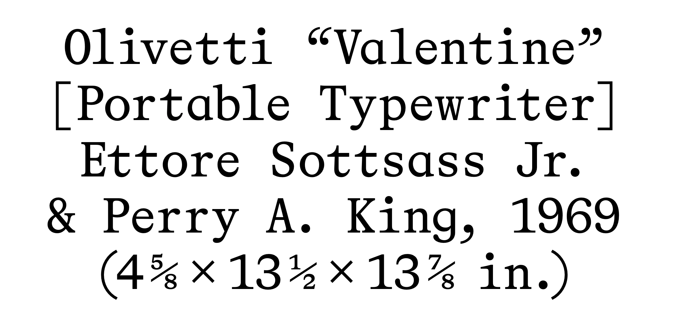
With its ultracondensed style, Review Mono by Ecal is a breath of fresh air in the world of regular-spaced mono. Inspired by the spirit of the classical book typeface Garamond, Review Mono presents a typewriter version infused with a modern twist on the historical style. It is well suited for editorial use.
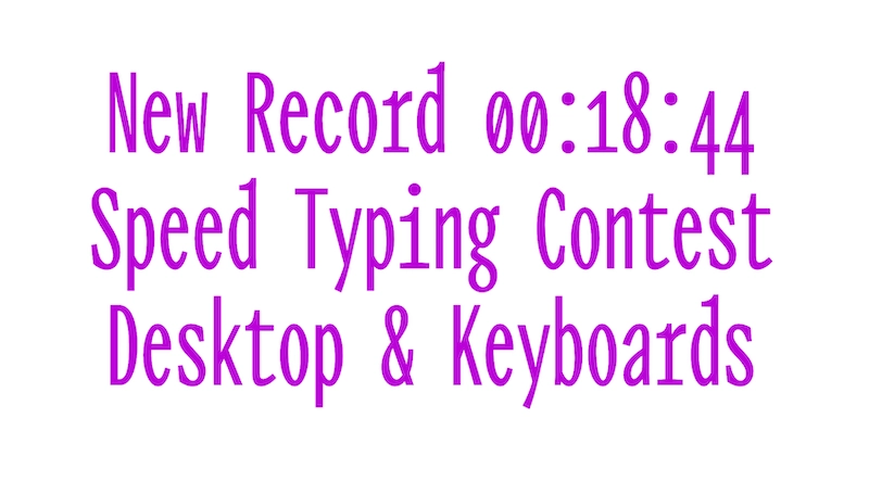 Review Mono in its Ultracondensed style
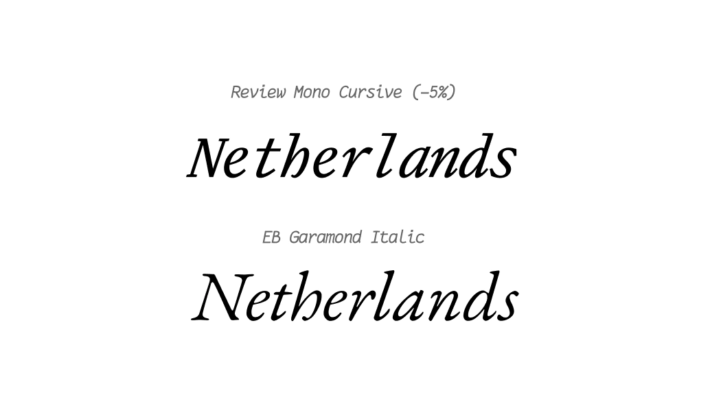 Review Mono (top) compared to Garamond (bottom). You can see some distinction in hand-written quality of serifs between the two, but they maintain similar contrasts in stroke and how the bottom right of the ‘h’ bends inwards
Cartograph Mono
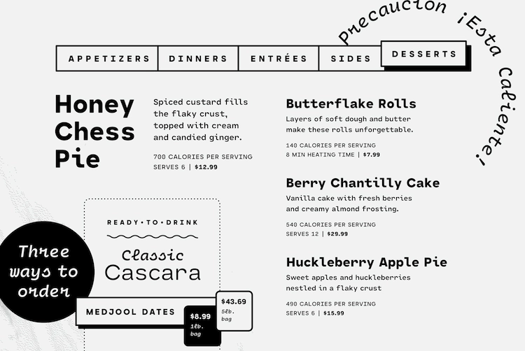
Cartograph® CF is a monospaced font family with a personality. Its rounded edges bring warmth to design. What sets it apart for me is the lush italics—characterized by hand-drawn loops and a distinctive half-cut ‘r’, making it instantly recognizable.
Cartograph Mono (by Caneri Fagen) also has code-friendly ligatures, and a proportional set accessible via OpenType.
Martian Mono
Martian Mono, by Evil Martians, is a monospaced version of the Martian Grotesk font for code style design. It is an open-source font and has two axes of variation: along the “Weight” axis, and along the “Width” axis.
Overhanging terminals, a closed aperture, and an almost complete lack of contrast lend Martian Mono a brutal assertiveness effect.
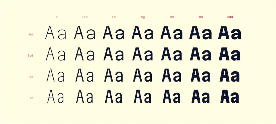 Martian Mono extends the personality of its Grotesk sibling to coding environments
Sligoil
Sligoil is a funky monospace open-source font with large inktraps created originally for the interface of indie videogame Unknown Number.
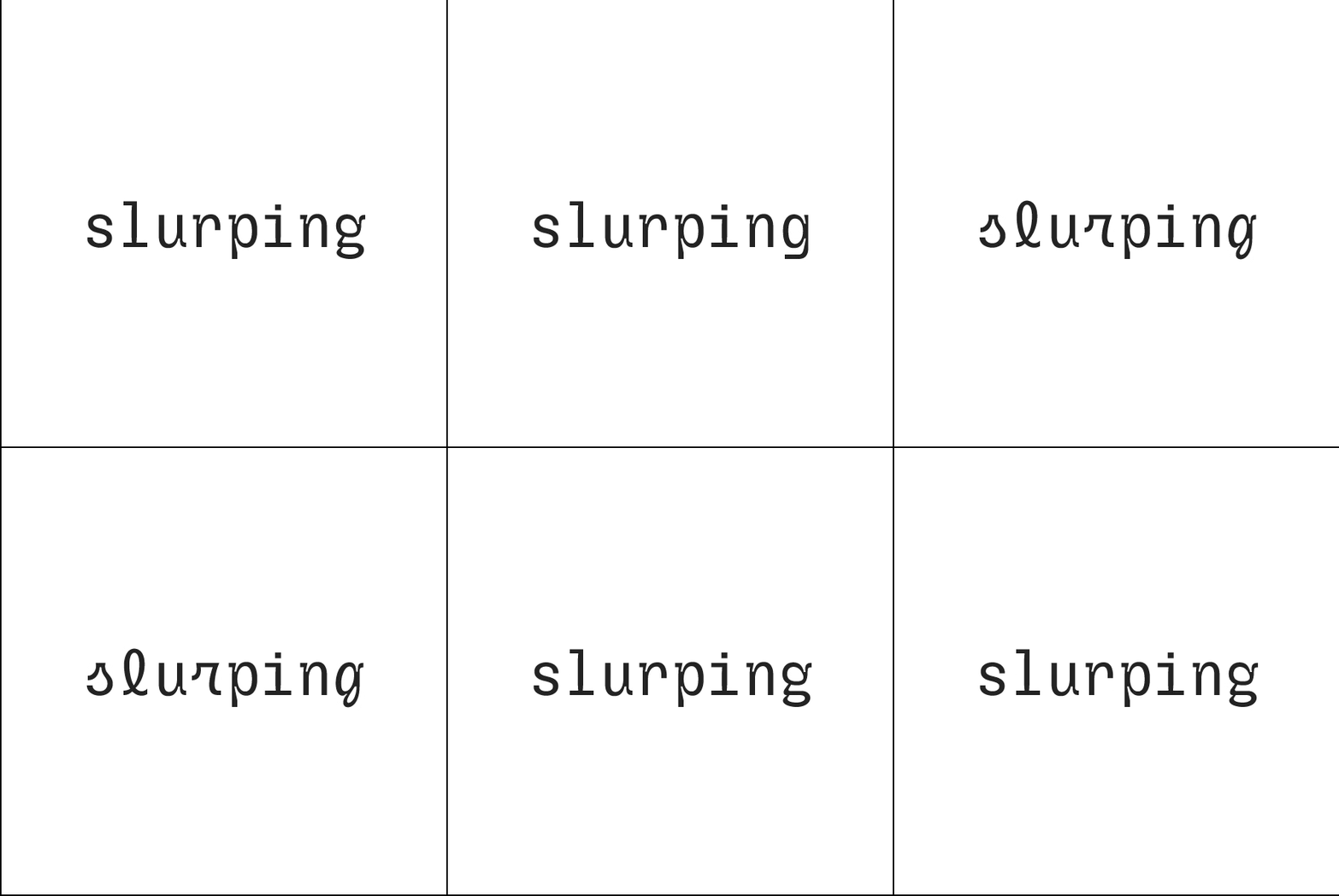
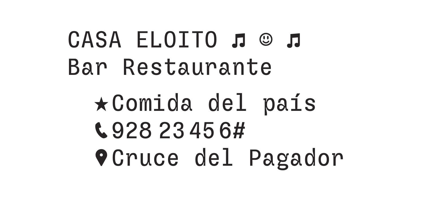
Sligoil has a collection of symbols and alternate forms, including upright italic letters but the star of the show is its monocluar ‘g’.
I’d be remiss to mention two more monospace typefaces I <3: Ikat Devanagari, whose pixel-based design Pooja has eloquently raved about; and italics in Fantasque, used on Fox Pass in captions.
To me, the beauty of monospaced typefaces lies in the way designers have adopted and transformed its legacy. Whether you're on the lookout for a cutting-edge, avant-garde aura or a throwback to the vintage charm of typewriters, the world of monospaced fonts has your unique requirement covered.
colophon
header typeface: jetbrains mono, header design by: kasturi
Disclaimer: All images in this article are properties of the respective foundries.
 3 / S C
