 3 / S C
I love blackletter typefaces. Love the historical flavour they add, love the contrast they bring juxtaposed with new digital type forms.
Blackletters come with a lot of historical baggage. from being the de facto typeface of the first printed Bible to becoming the de facto of authoritarian regime, Blackletters have seen it all. This sitepoint article covers the history of blackletter in much detail.
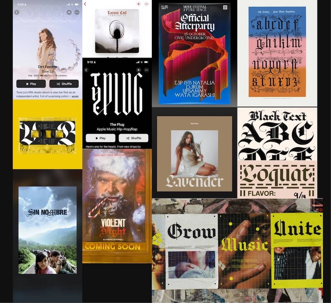
I started seeing blackletters some time ago, and began to collect them in a moodboard. Blackletters are seeing kind of a revival and are not being limited to metal and occasional hip-hop album covers. Imaginative designers are using blackletters to build authority, create large degrees of contrasts. These designs use Blackletters flourish to modernist designs to surprising effects. Or often, they are thrown in a cauldron with other decorative and zany pieces, because why not? Designers also deserve to have fun. 🪩
So these are a few of my favourite blackletter typefaces.
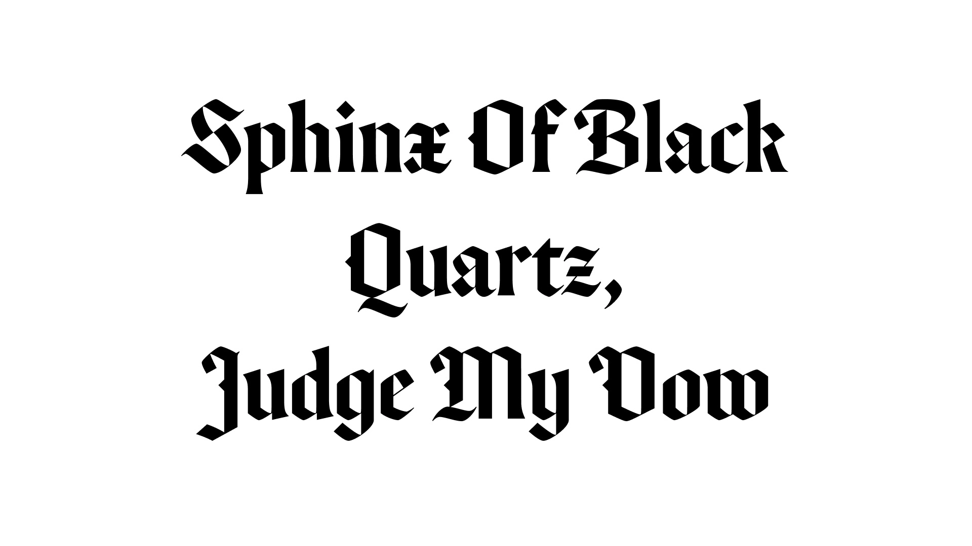
1. Canela Blackletter
You know Canela, don’t lie. Most designers do.
Canela Blackletter is a companion of the OG serif typeface, designed as a homage to signage in Mexico.
Makes me curious about blackletters in Mexico!!!
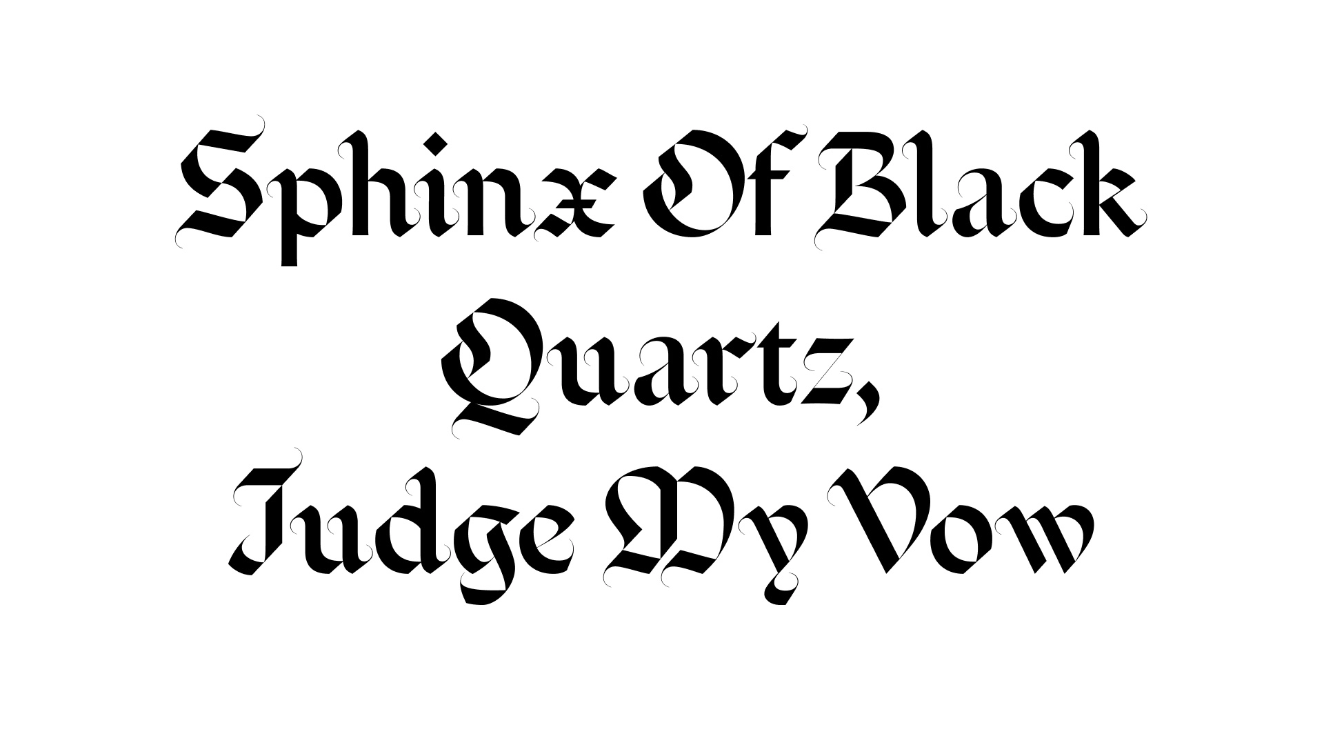
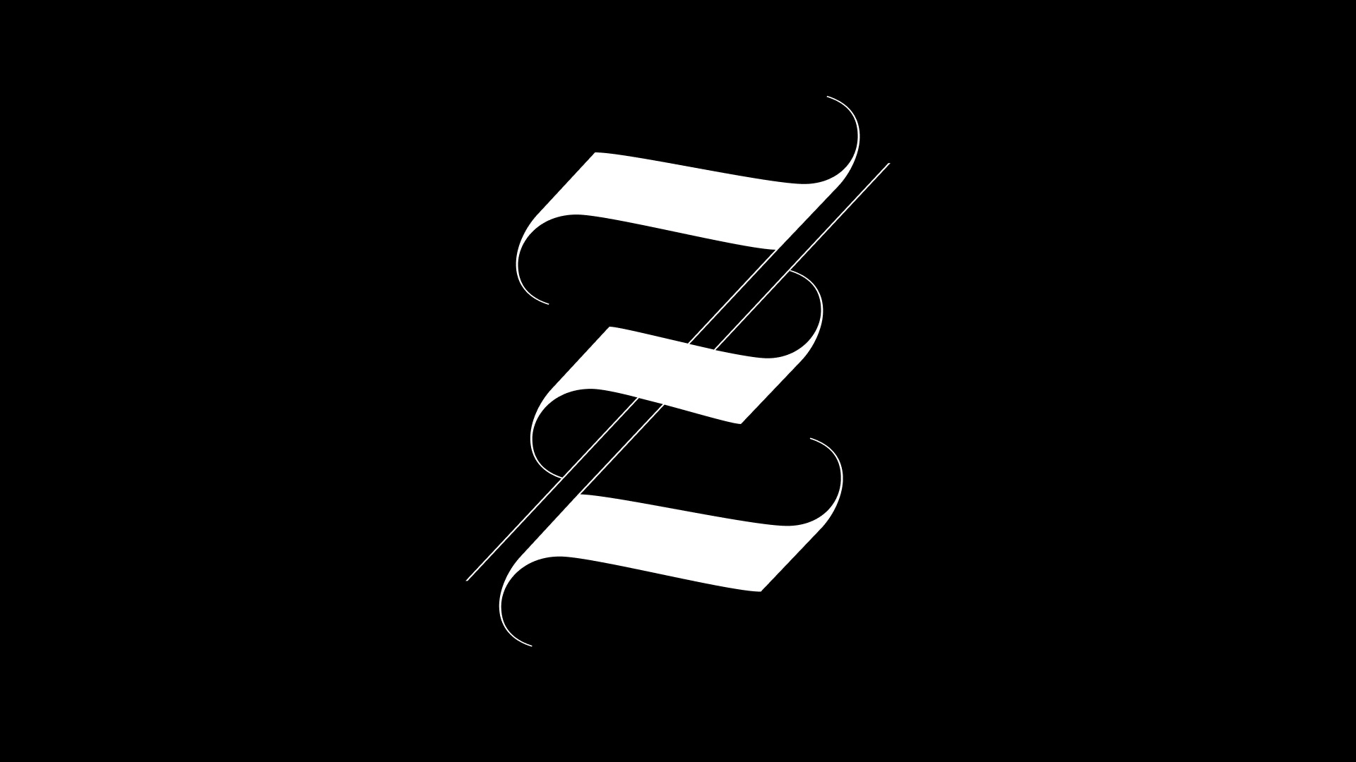
2. Emeritus
A round blackletter with high contrast accentuated by thin terminals, Emeritus feels like a living organism. It has gorgeous uppercase letters, especially that Z.
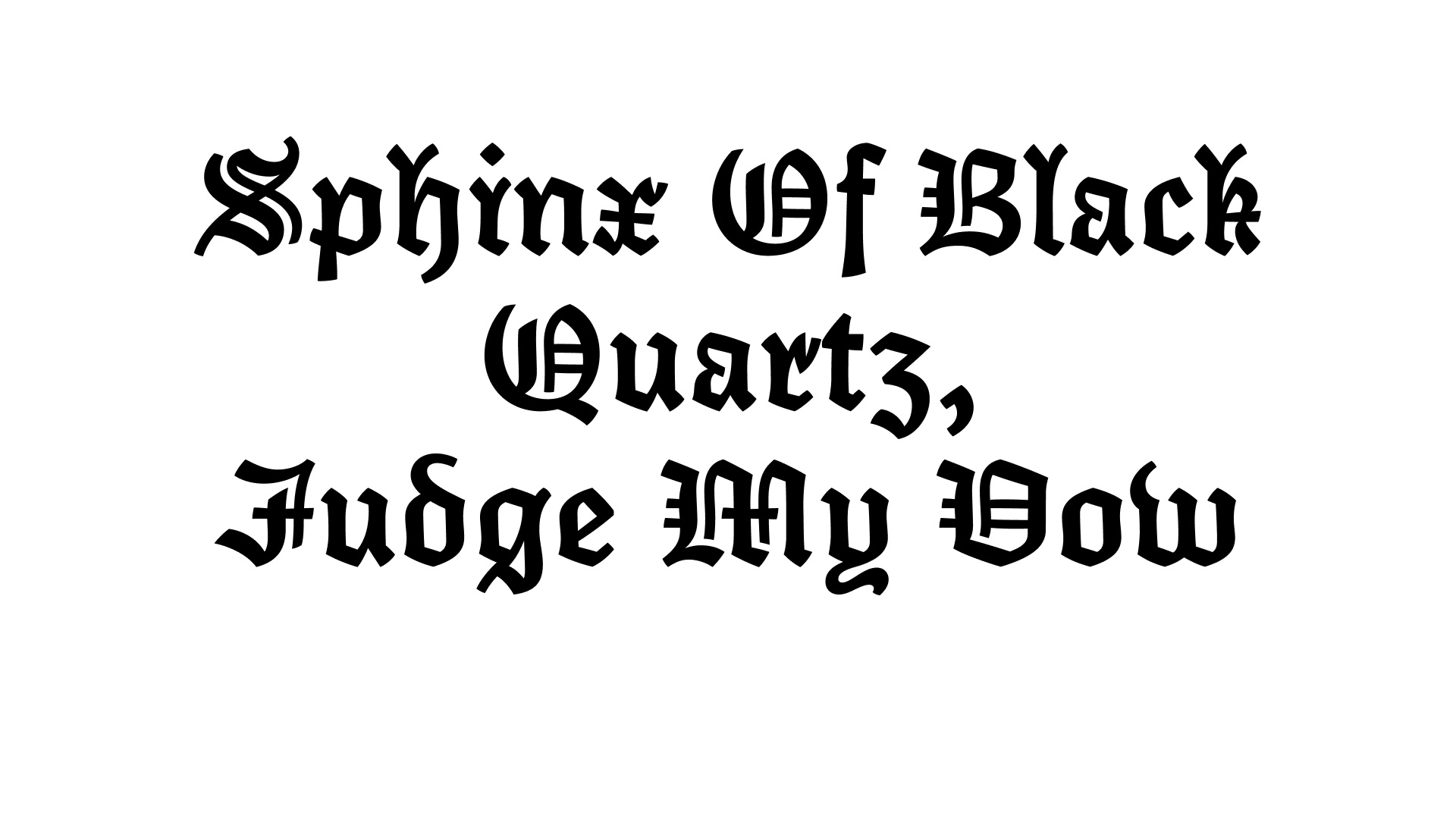
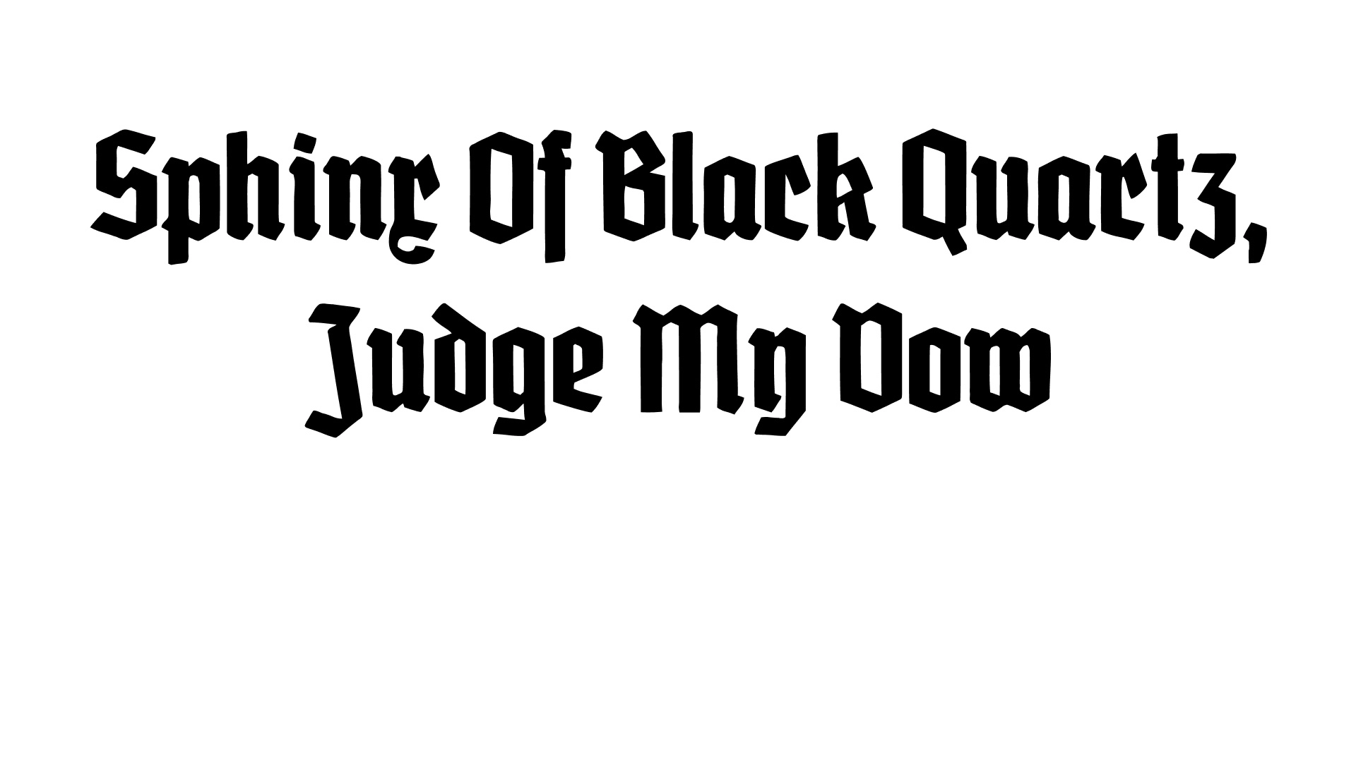
3. Elfreth
Elfreth creates a curious blend of curves with angles and edges to make a more modern, less uniform, and more legible blackletter form. The thoughtfully more open terminals of this textura face give it a friendly tone.
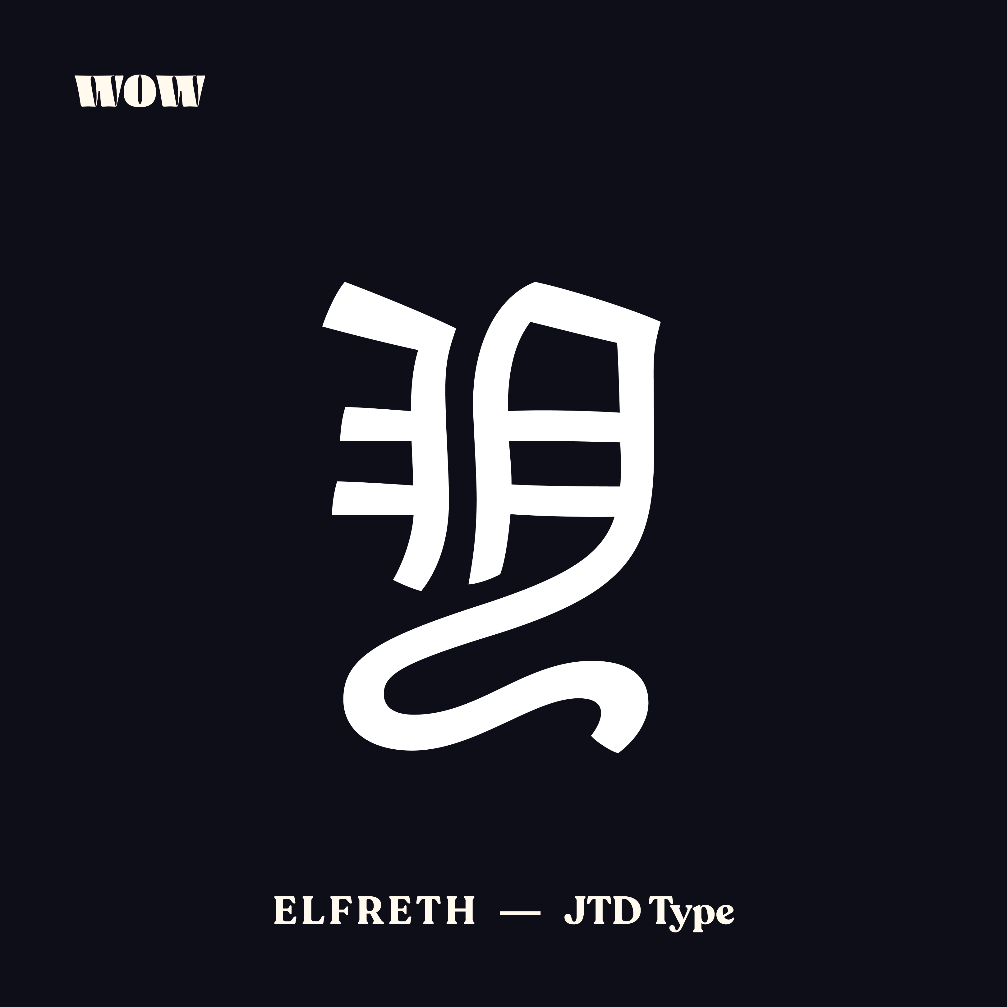 Elfreth has a legendary Y, as seen on wowtheseletter
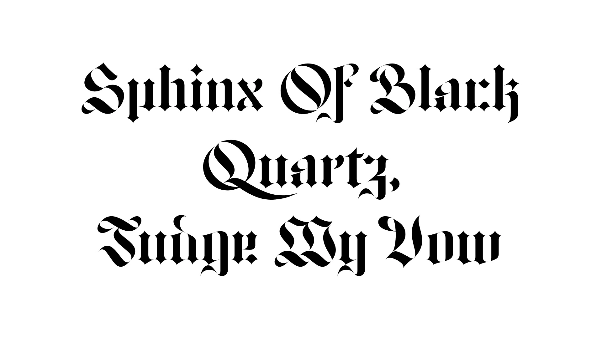
4. Grobe Deutschmeister
Grobe Deutchmeister is an open-source blackletter reflecting calligraphic brush-strokes. I love it for its workhorse quality - in the right (or crazy) frame of mind, you could get away with using it in body copy too. 😉
5. Jabin
Jabin has the most flourish of all the typefaces in this list. Free for personal use, this typeface also comes with beautiful opentype features like ligatures, alt forms, et al.
Get Jabin here.
 jabin’s variable features allow playing with its flair
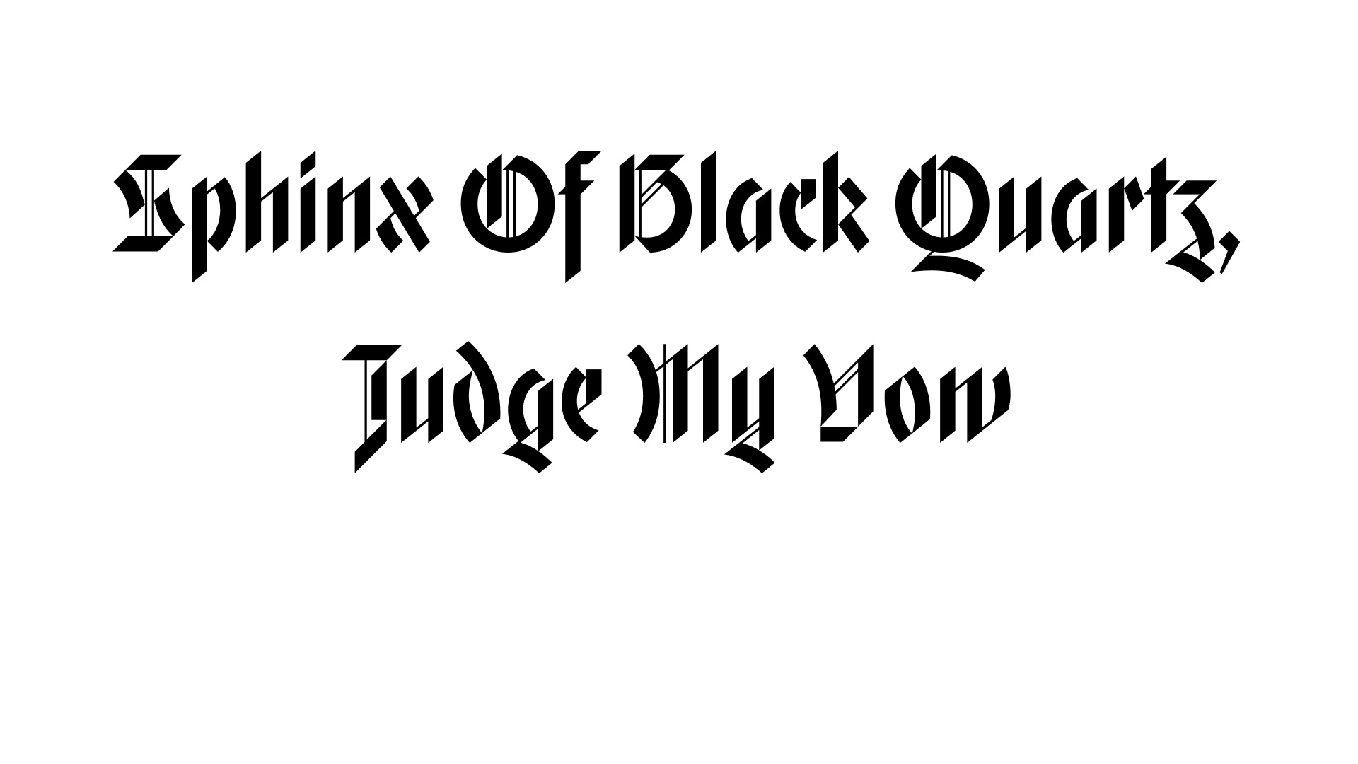
6. Gryffensee
Gryffensee, a modern, accessible and rational interpretation of Bastard, holds its own. While Bastard is more decorative with the upper- and lower-cases having a wildly contrast in their widths, Gryffensee brings a more rational approach to this to create its unique identity.
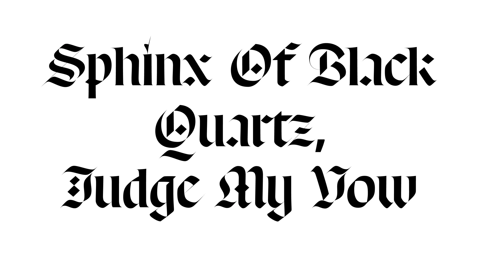
7. Respira Black
Respira Black by Sharp Type is such an obviously easy choice.
What are your favourite typefacess?
What kind of typefaces do you like? Do you love the boundary-pushing decorative serifs, or the efficient workhorse sans-serifs? Or do you have a thing for the quirky monos?
Tweet to us, tell us in Insta DM — we are watching out for your picks!
colophon
header typefaces: fontin, grobe deutschmeister, phaeton, header designed by: tejas