 3 / S C
I started 2023 with a typography workshop for the team at 3 Sided Coin so it is only fair that I mark the end of the year with them. As one of the results of the workshop, 3 Sided Coin published their very first Hindi post on their blog, and showed off their Devanagari typography chops in the process. It can’t be disputed that these days very little is written about typography and design in Hindi, and Bhavya’s essay about WeWork’s new illustrations is an important step towards correcting that wrong. This Hindi post is also a small contribution towards the same end.
Devanagari typography: New typefaces, new flavours
In today’s essay, I want to talk about three recent typefaces that have done an excellent job of moulding Devanagari letterforms into new and interesting forms. All three are display typefaces, i.e. they are appropriate for usage in headlines and short paragraphs. Used with the right text typeface, they would each give any essay, book or website a unique personality. There is one other thread that binds the designs together — all the typefaces were designed either as Devanagari-only or alongside Latin; and none are extensions of pre-existing Latin typefaces.
Ikat Devanagari (Lipi Raval, Future Fonts)
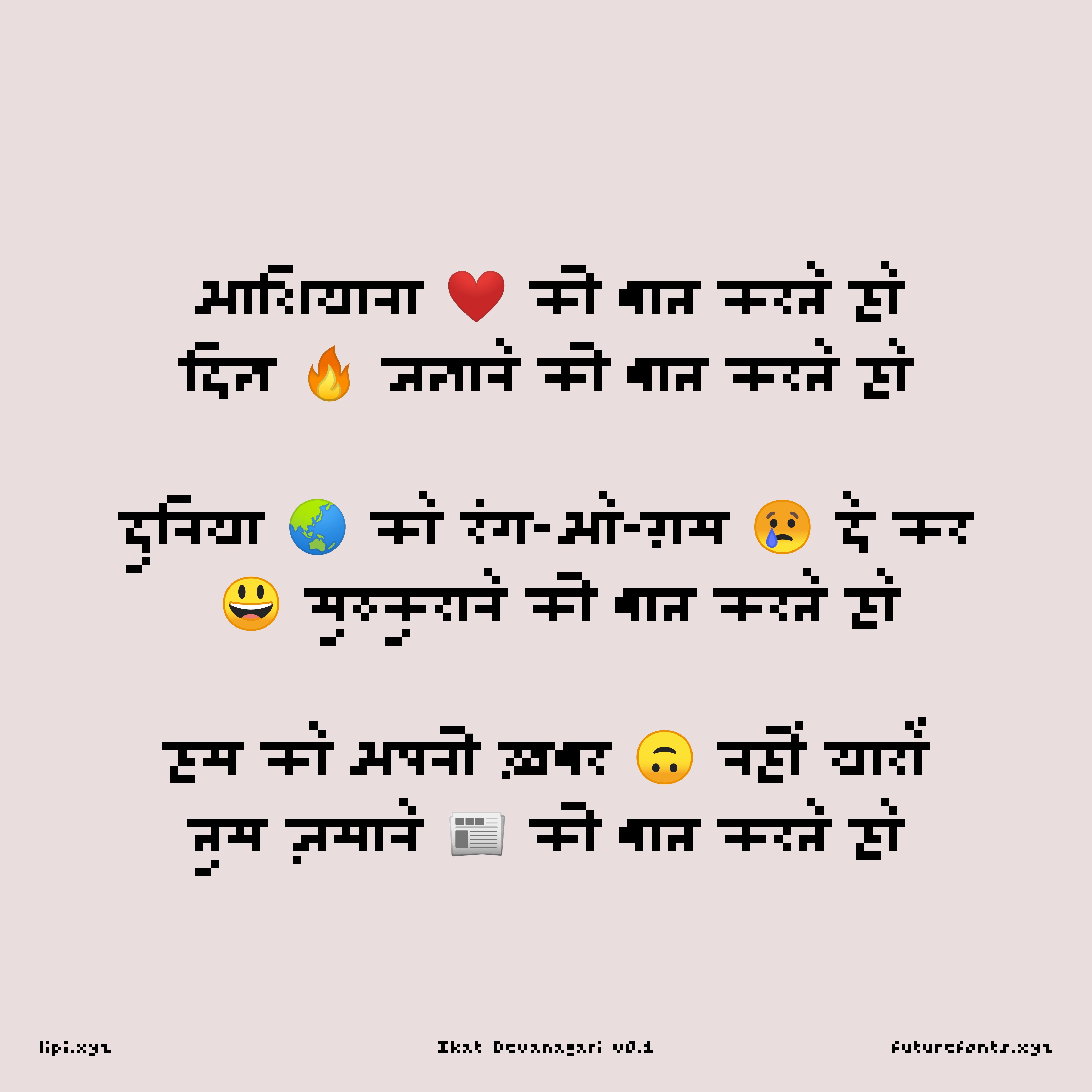
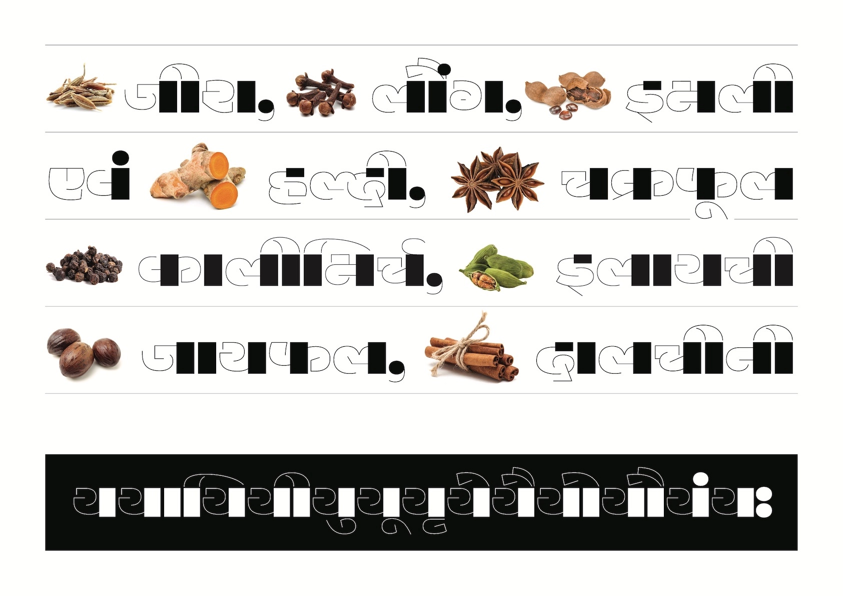
Of recent Devanagari typefaces, Lipi Raval’s Ikat Devanagari is, by far, my favourite. It may look like an ordinary pixel typeface at first glance, but Ikat goes a long way in shattering strongly-held beliefs about the script. Devanagari and other Indic scripts have been referred to as “complex”, but in this design even the most complicated shapes have been accommodated in a grid that is merely four pixel high. Ikat forces us to reckon with who calls a script like Devanagari “complex”, and the context in which that label is conferred.
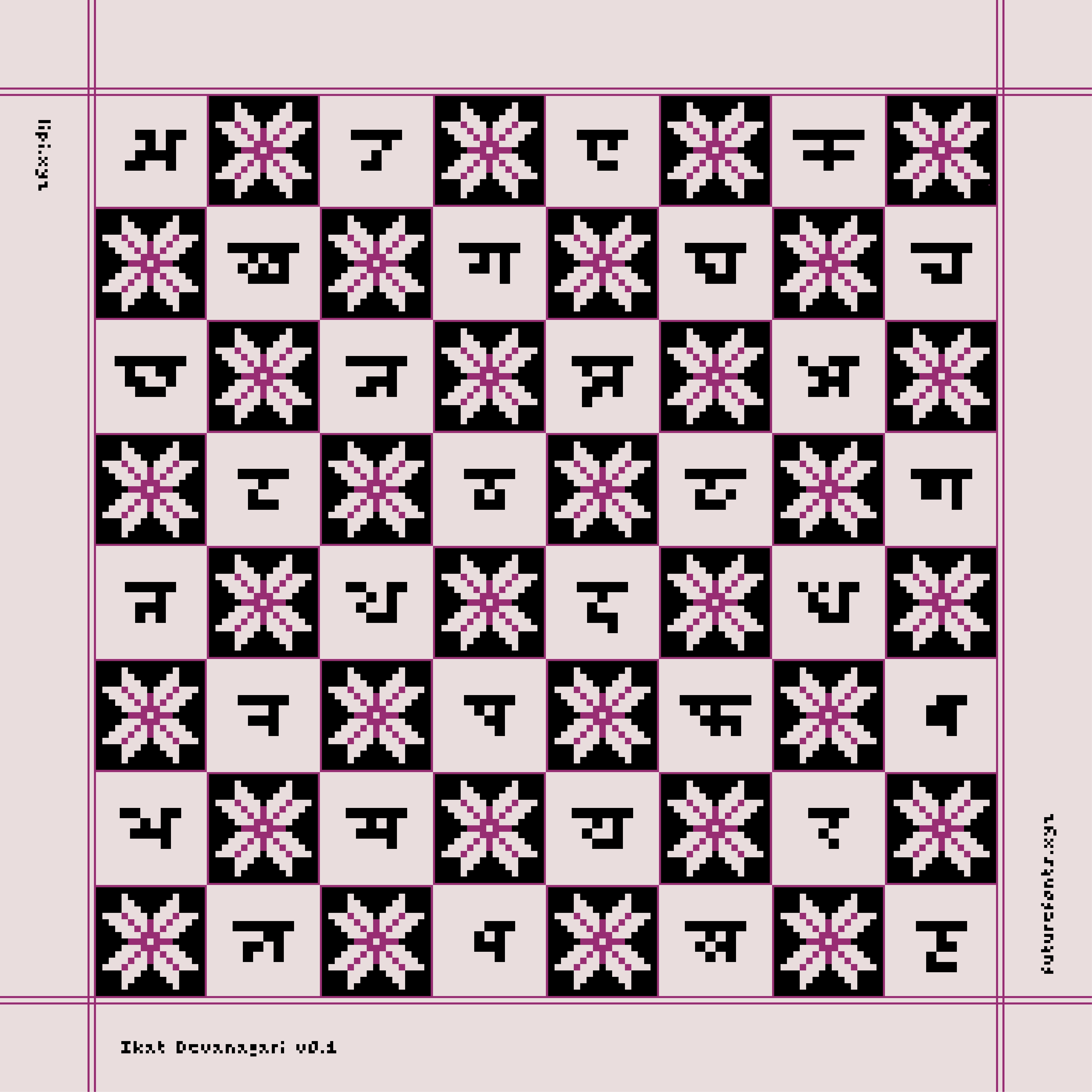
The story of Ikat Devanagari began during the COVID-19 pandemic. Like the rest of us, Lipi was stuck at home, and her dominant hand was suffering from mobility issues. In these circumstances, she decided to use the pixel font editor, Fontstruct, to draw a new design. On the one hand she was thinking of the Patola textiles of Gujarat’s Patan district, and on the other, she was admiring the Latin pixel fonts in Toshi Omagari’s Arcade Game Typography that were trying to make do with the least number of pixels. With these references in mind, she challenged herself to design a Devanagari pixel typeface with the minimum pixel height. Lipi sought the essence of Devanagari letters, and then reduced them to forms that used as few pixels as possible.
 ikat fabric pattern was inspiration for ikat typeface
While we were talking about Ikat, Lipi wondered aloud why type designers are afraid of readers only accepting designs with shapes they are familiar with. She said she finds this thinking particularly odd because the same readers have historically read poorly printed text with broken letterforms. Not only that, they see a range of unique shapes created by sign painters in their everyday lives. After designing Ikat Devanagari, Lipi feels free of this cautious point of view. She asks — if Ikat Devanagari can be read, then what is stopping us from bravely experimenting with the script’s letterforms even more?
Vilom Devanagari (Sarang Kulkarni, EkType)
The second font on our list is Vilom Devanagari. The letter construction in Vilom breaks all the rules of traditional Devanagari calligraphy. In the same letter, some strokes are delicate like silk skein, while vertical ones — like the full and half stems — and marks — like the anusvara and nuqta — are solid and heavy. This combination may sound odd, but in Vilom, these opposing ideas not only coexist but look elegant together. What’s more, one doesn’t even miss the headline.
When I asked Vilom’s designer, Sarang Kulkarni, how the idea of this typeface came about, he told me that the seeds for the design were sown during a regular drawing exercise they do at the EkType studio. Every evening the team chats around tea, and sits down together to draw. They use different design briefs each day, and that helps the team give their ideas new flight. Some results from this exercise make it to Instagram, while others, like Vilom, end up as full-blown typefaces. You can check out EkType’s typographic experiments on Letterbox India.
During our meeting, Sarang reminded me that every typeface doesn’t have the same goal. Some, like Vilom, show us that Devanagari needn’t always be sombre-looking, it can be playful too. He admitted that not all graphic designers excel at calligraphy or lettering, but that shouldn’t prevent them from using adventurous letterforms in their work. With Vilom, he wanted to offer them a delightful, new tool.
Ouma Devanagari (Gunnar Vilhjálmsson and Hitesh Malaviya, Universal Thirst)
Where the first two typefaces on this list are obviously compelling, Ouma Devanagari warrants a closer look. You might think it is just another monolinear typeface, but its quiet qualities are what make it special.
Ouma began as a typeface for an English design magazine. During the development of the Latin design, Gunnar Vilhjálmsson felt that the same ideas would also work very well in Devanagari. He shared that notion with Hitesh Malaviya, his co-designer, and with that Ouma Devanagari was born.


Ouma takes its inspiration from typewriter fonts. Due to technical limitations, letters in typewriter fonts have the same width. It doesn’t matter how much space the fundamental shape of a letter needs, all of them must expand or contract to fit the same width. In design terminology, such fonts are described as monospaced. But Ouma is not monospaced. According to Gunnar, it is an attempt to reinterpret the rhythm and pattern of monospaced fonts into a proportional design. I believe that the success of this typeface lies in the restraint shown by Gunnar and Hitesh. In several letters, the design departs from traditional structures to incorporate geometric shapes, but the result never looks forced. On the whole, Ouma shows excellent balance between being distinctive and staying useful, and that’s no easy feat.
In our conversation, Gunnar and I wondered if the shapes of Ouma felt altogether novel to some readers because typewriters, especially Devanagari ones — whose letters inspired this design — have disappeared even from our memories in the last few decades. New generations of designers have neither seen nor used these typewriters. It is a sign, if there was ever one, that the design community in India needs to do a much better job at learning about and remembering its own history.
Before I bid adieu, there is one last typeface I want to mention: Kimya Gandhi’s Fit Devanagari, which is a part of David Jonathan Ross’s Latin-first, multiscript Fit typeface family. It is an excellent specimen of how the many curved shapes of Devanagari can be made rectilinear and that too with the thinnest possible counters.
I want to thank Lipi, Sarang and Gunnar for speaking to me for this essay. And I hope that seeing this set of one-of-a-kind typefaces will inspire you to take some risks in your next Devanagari project and nudge you to push the envelope further.

Pooja Saxena is an award-winning typeface designer, lettering artist and typographer.
Pooja divides her time between being a team member at TypeTogether, and her own independent practice, Matra Type.
colophon
header typeface: ikat devanagari, header designed by: kasturi