 3 / S C
Recently, I worked on designing a mobile app primarily targeting users who would interact with it in their regional Indian languages. This article shares my key learnings from this multilingual design experience.
Choosing typeface
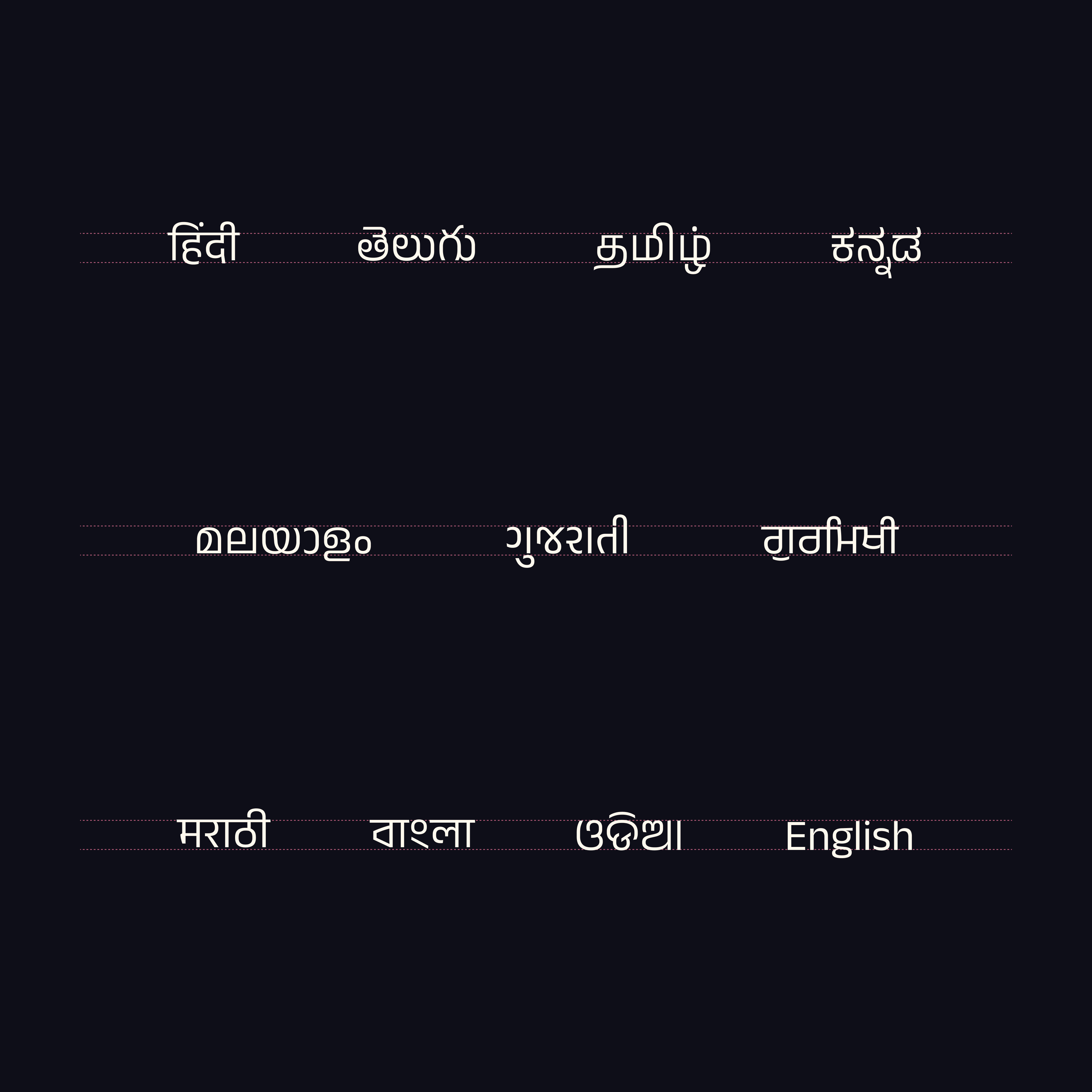
The app we worked on needed to support nine Indian scripts (Hindi, Telugu, Tamil, Kannada, Malayalam, Marathi, Gujarati, Punjabi, and Bengali) along with English. Since I could personally evaluate only Hindi and Telugu, I focused on selecting large type families that supported all target languages. This approach ensured that the typographic characteristics chosen for Hindi and Telugu would carry over to the other scripts.
Given our constraint of using only free typefaces, our options were limited. After careful consideration, I shortlisted two families by Ek Type: Anek and Baloo 2.
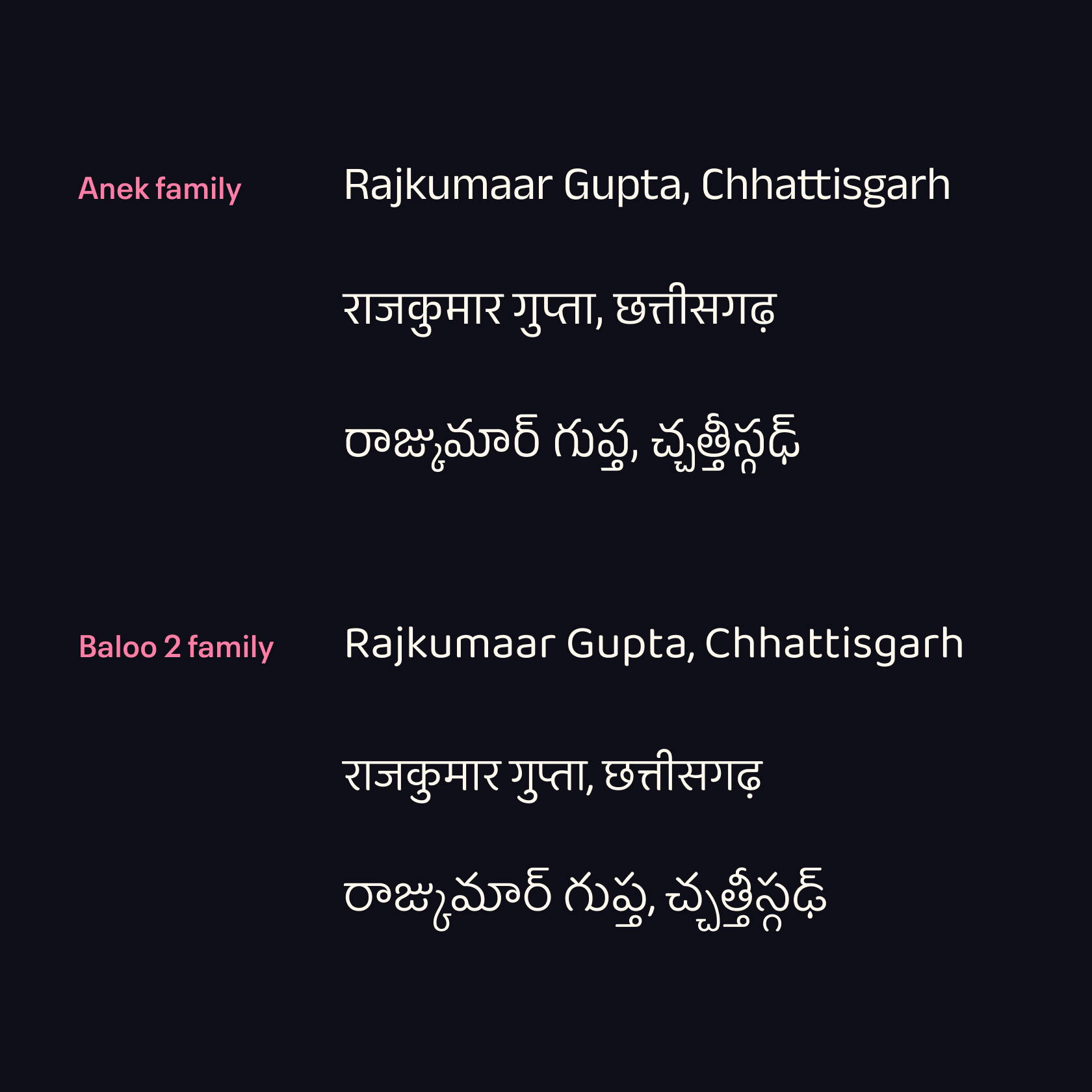 comparing Anek and Baloo 2 type families
While I liked certain characteristics of Baloo 2 in Devanagari and Telugu, I ultimately chose Anek for its consistency and narrower character width. This was crucial because translations in Indian languages often result in longer text strings compared to English (more on this below).
Managing vertical space
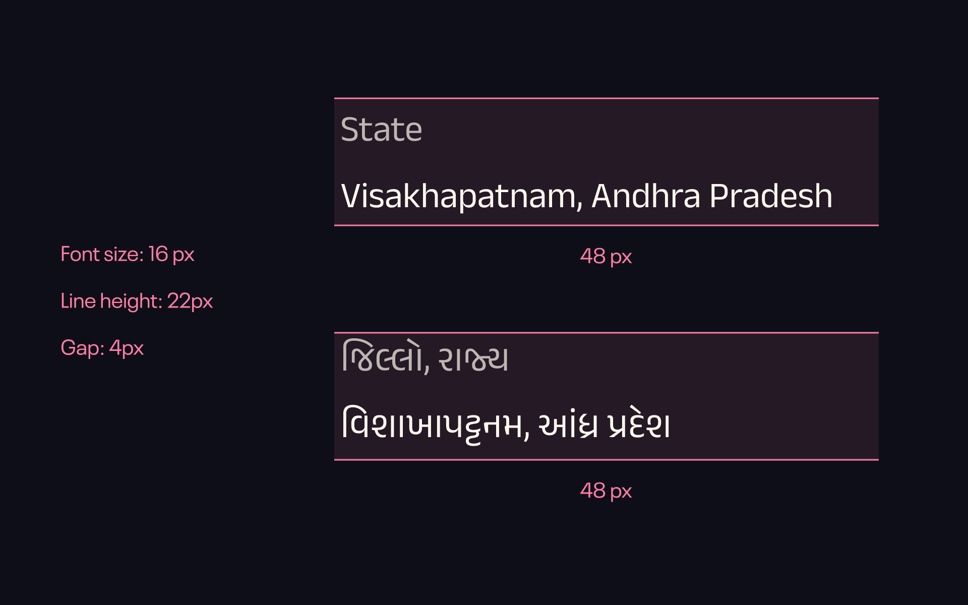
I knew from my familiarity with Hindi and Telugu that Indian scripts generally require more vertical space than English. However as I could not read other scripts, I couldn’t evaluate the line height that would work across all the supported scripts.
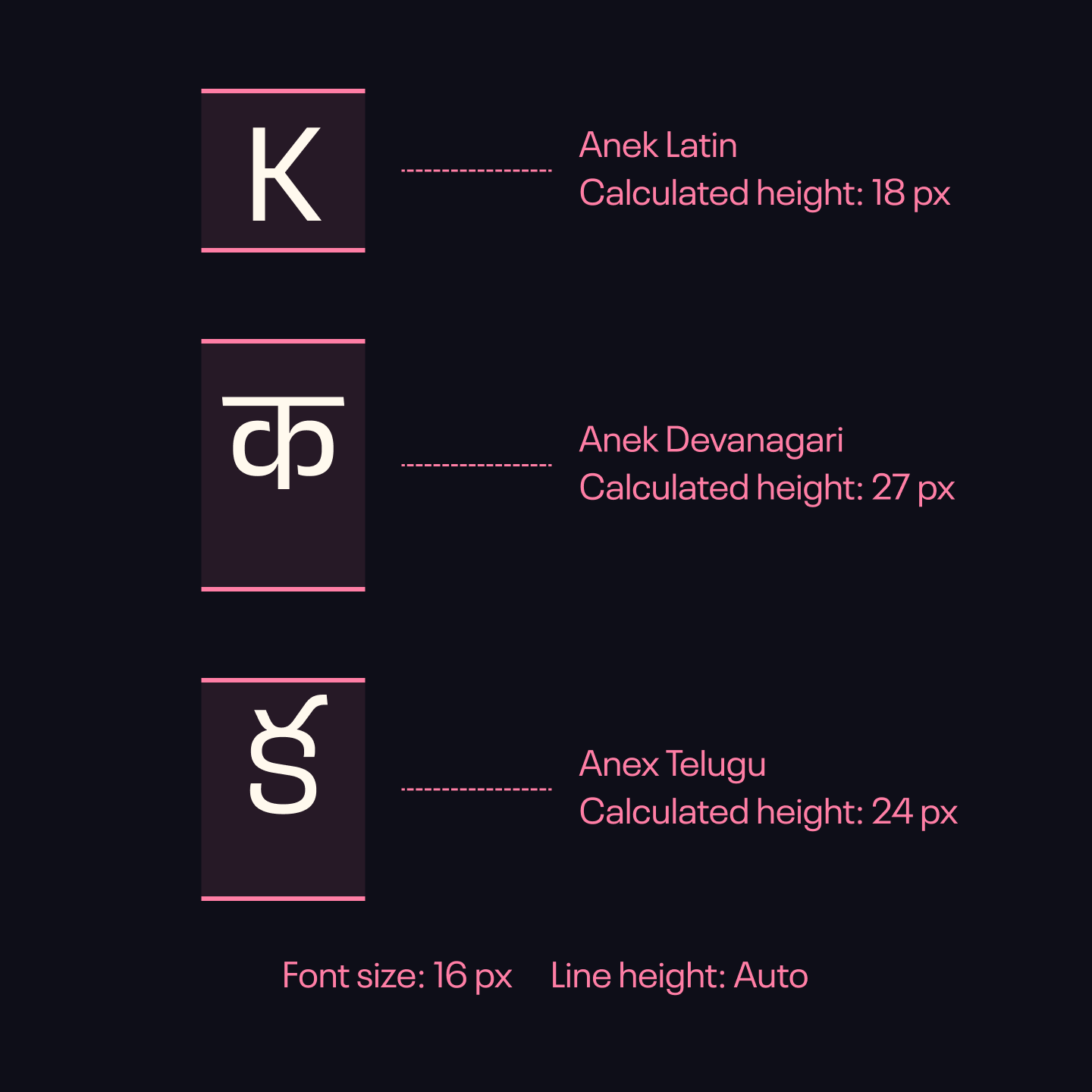 line height when set to auto varies across different scripts
Initially, I considered leaving the line height set to auto. However, I soon discovered a significant issue. Even within the same font family, the auto line heights varied considerably across different scripts. This inconsistency would have made it extremely difficult to plan UI elements especially on a mobile layout.
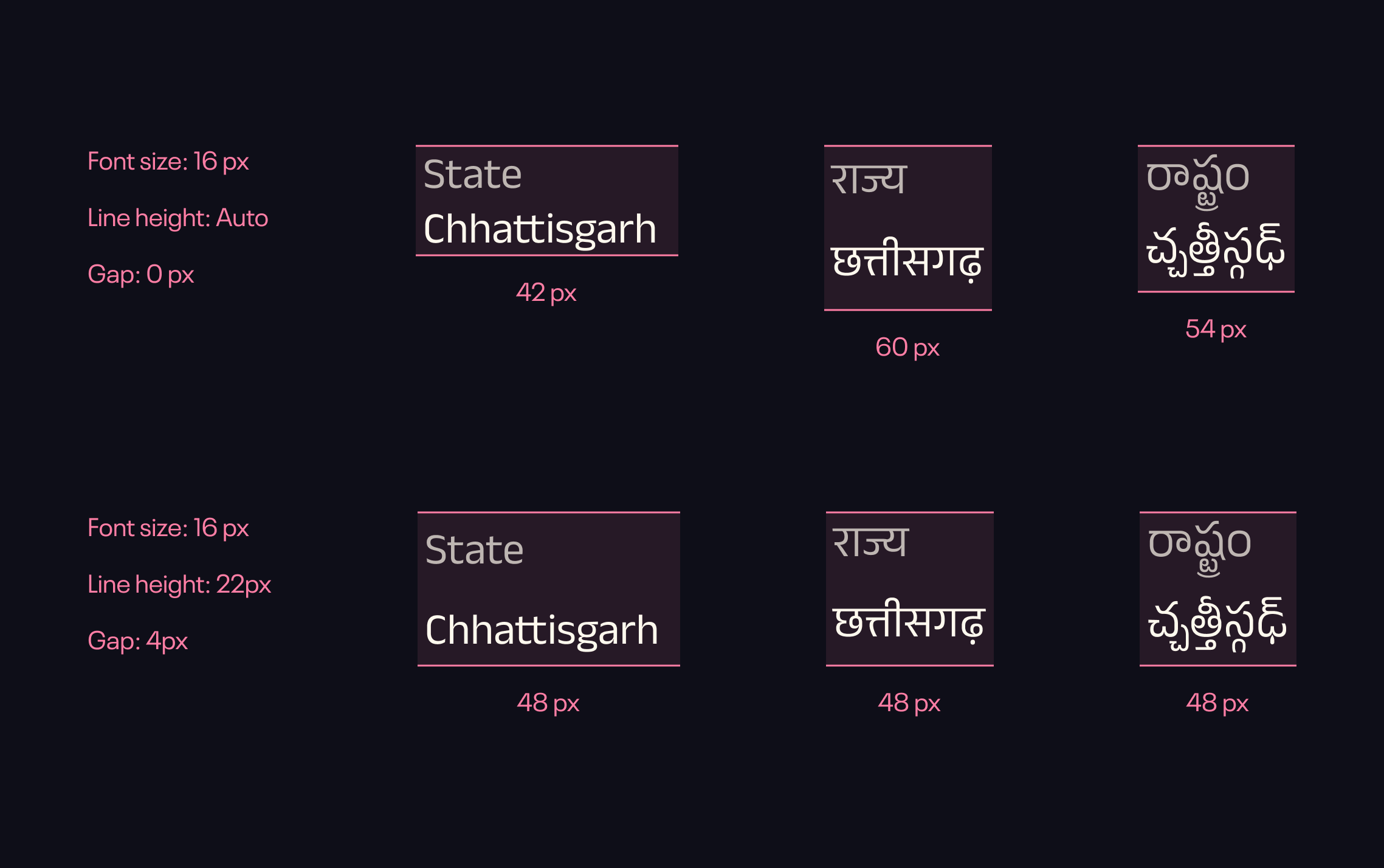 before and after adjusting line height and gap
To address this, I conducted thorough testing with sample text in English, Hindi, and Telugu. This allowed me to define type sizes and line heights (the vertical space between lines of text). that worked consistently across all three scripts, creating a more uniform visual experience.
 line height and vertical text working well for Gujarati
This approach to vertical spacing was partially validated when Tejas helped me with Gujarati translations, and they worked well.
Accommodating Phrase Length Variations
It’s important to remember that phrase lengths can vary between languages. What might be a concise expression in English could translate into a much longer phrase in an Indian languages.
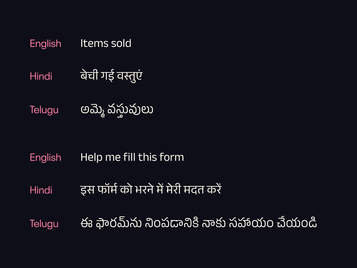 same phrase translates to different lengths in different languages
When designing for multiple languages, it's often better to avoid multi-column layouts for displaying information. This is because varying phrase lengths across languages can disrupt the layout. This is especially crucial when position of information is important, such as in an ID card or a ticket as you can see in the image below.
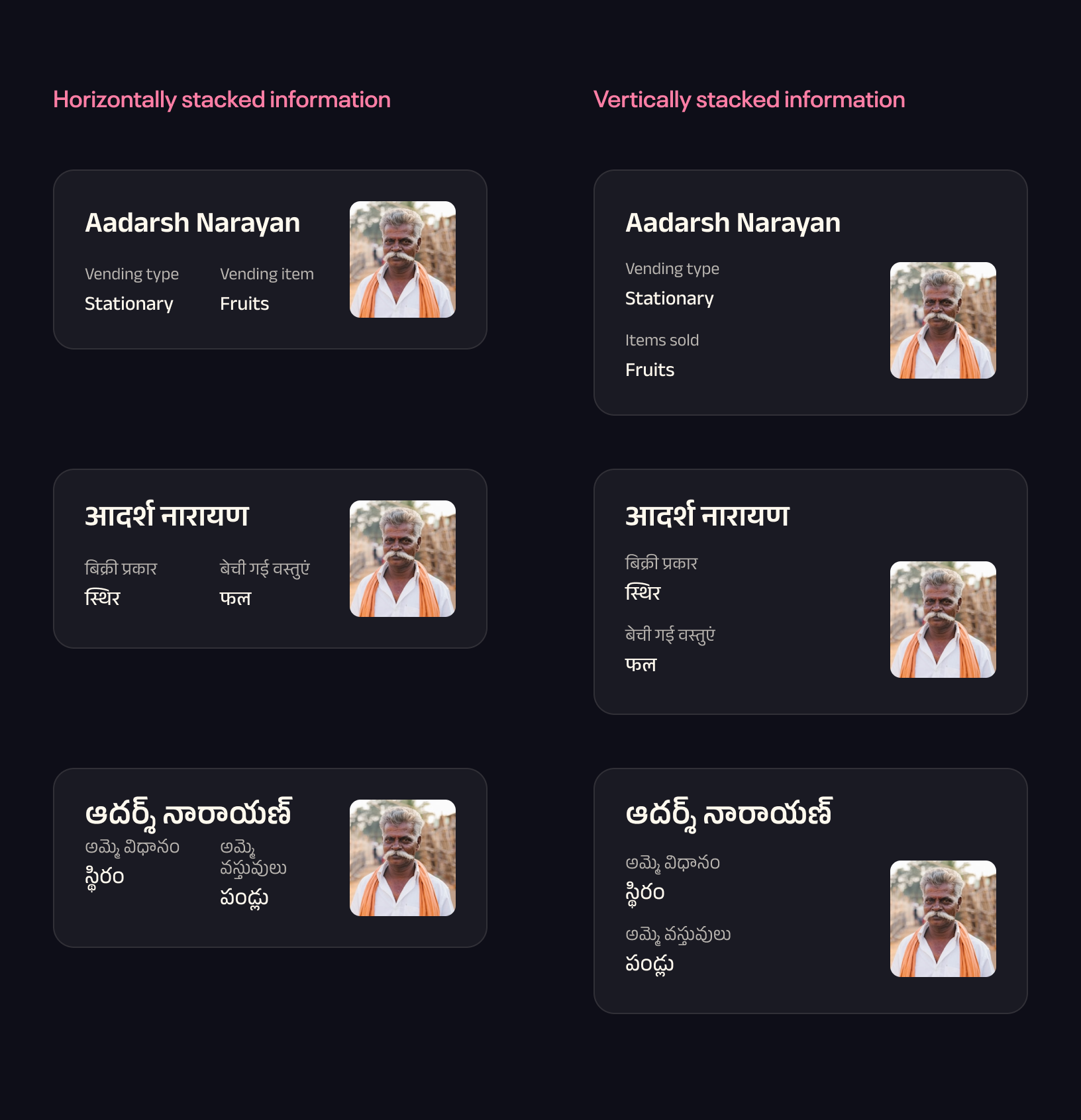 Information wraps in telugu when stacked horizontally. This problem is less likely when information is stacked vertically
Regularly testing design across scripts
It is very important to check even small changes across multiple scripts because of the reasons described above. Fortunately text variables in Figma make this otherwise difficult job quite easy.
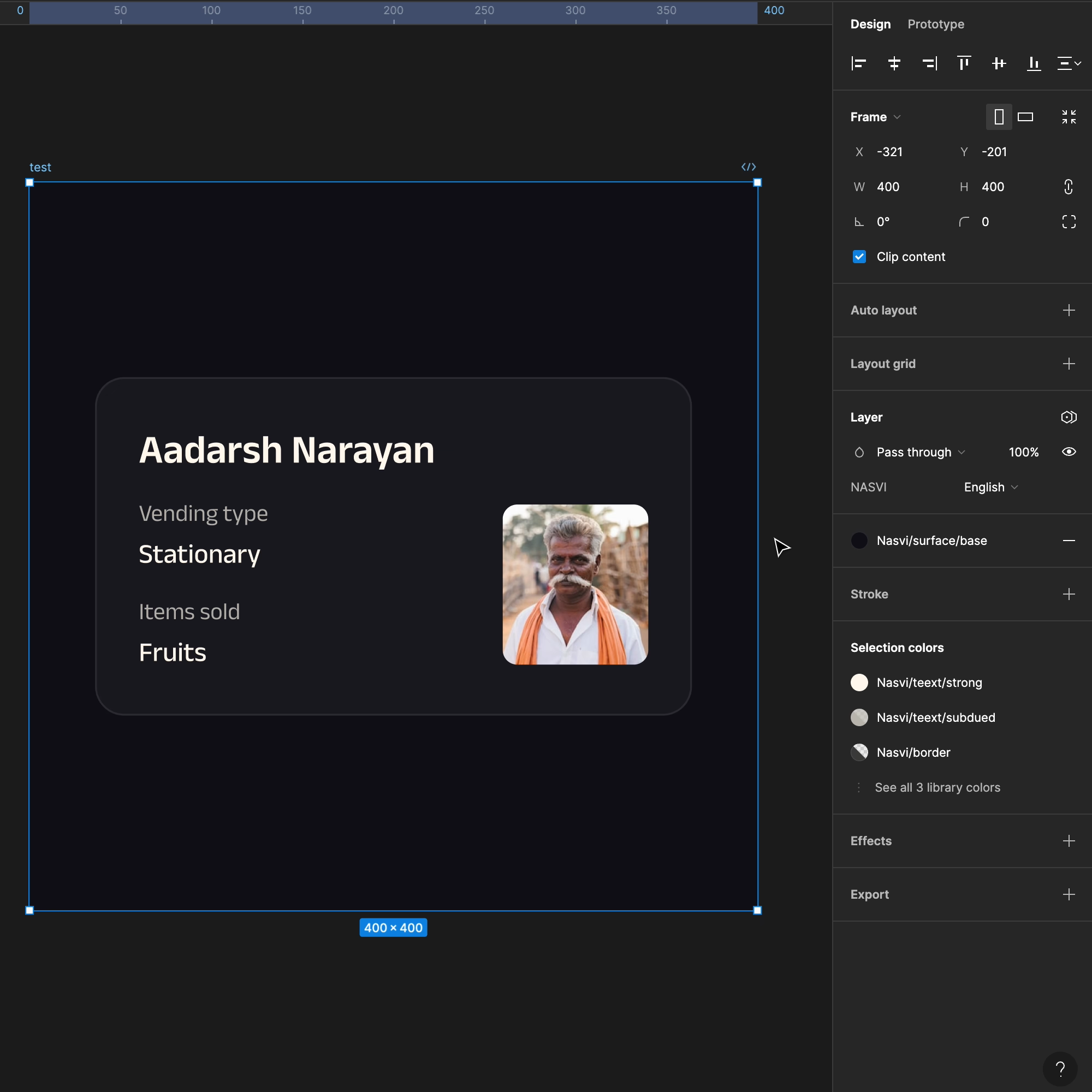 Using Figma variables to test multiple scripts
Conclusion
This first experience designing for multiple languages has given me a much better appreciation for the complexities involved, but there's still a lot more to learn. I hope this article serves as a helpful starting point for anyone trying to design their first multilingual app.