 3 / S C

During my mentoring sessions with ownpath, a recurring question that comes up is: how can we arrive at design decisions and rationally justify them?
When you are comparing multiple options with each-other and weighing the pros and cons of each, how do you pick one over the other with a non-emotional reasoning?
We will use the following example.
context
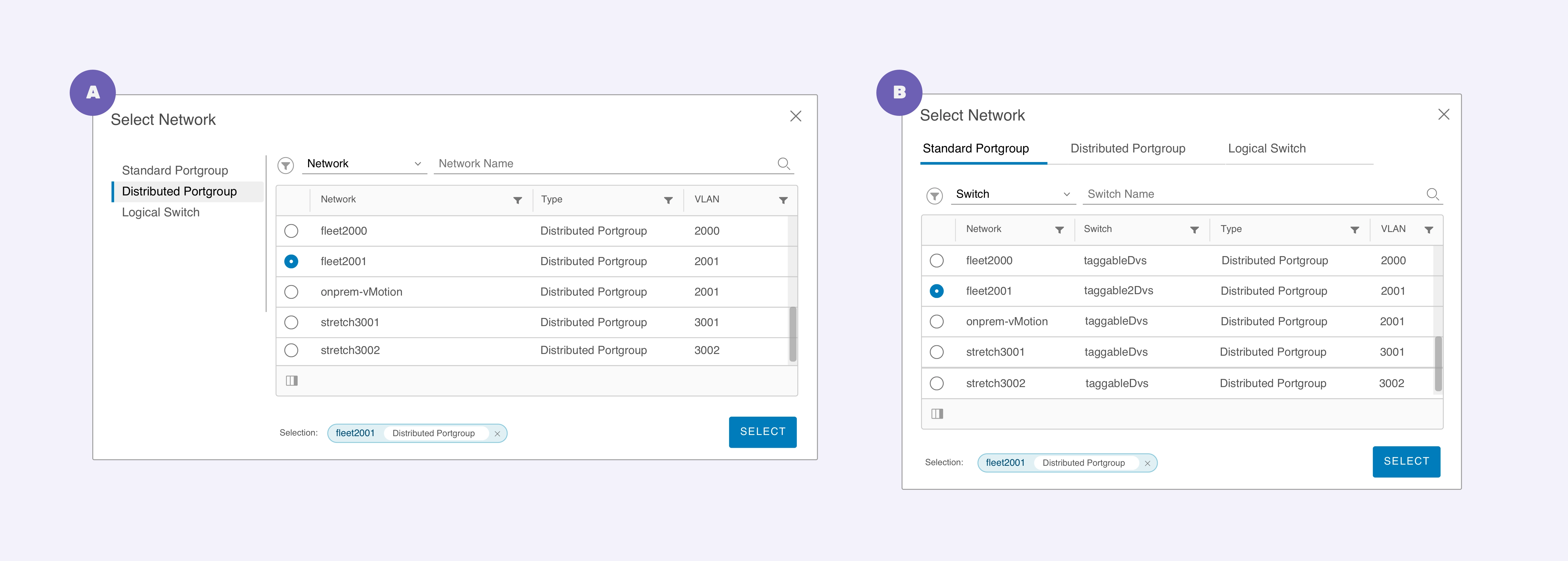
- The Network list is grouped by default into three tabs.
- The default selection of the tab depends on the use case.
- Search is available to further narrow down the list of networks.
- The selector component should be displayed in an overlay for most cases.
- It is also expected that the component could be displayed inline or in a modal for certain use cases.
- This interface is used on large screens, and does not need to be adapted to smaller screens.
 Tabs on top has a clear advantage at being a single-column solution that can be adapted to multiple screen-sizes.
Both our interfaces contain the following same elements:
- Controls
- Tabs to navigate through high-level groups for the data-tables
- Filter
- Search bar
- Data Tables
Now that we’re acquainted with the background, we can start asking some questions to probe further. What works better and in what context?
Let’s look at the two options closely.
a. Tabs on top
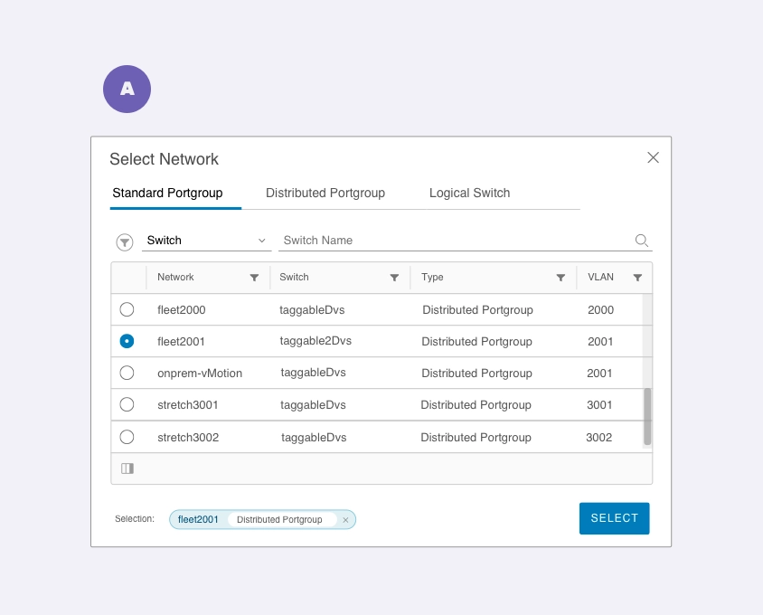 Tabs on top has a clear advantage at being a single-column solution that can be adapted to multiple screen-sizes.
Of the two interfaces, the tabs on top work very well for the following scenarios:
- The number of tabs remains within a permissible limit, making them visible within the window without overflowing. However, it’s important to consider when the number grows. In that case, the designer has to figure out a way to prioritize some tabs and keep the other tabs easily accessible.
- Having the tabs on top gives the interface a single-column structure, which can be optimized for a variety of screen sizes relatively easily.
- The Controls are visually grouped together, creating two clear distinct areas for Controls and Data. This creates a nested relationship between the tabs and filters + search, without splitting the hierarchy into Primary and Secondary controls. However, the designer needs to create better differentiation between different levels of controls and data.
- Users might find it easy to make changes in the controls and see the data change right below.
Now, let’s look at the other option.
b. Tabs on the left
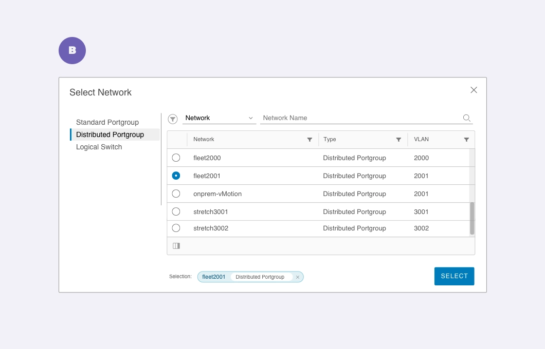 Tabs on the left panel splits the controls into Primary and Secondary sections.
In this version, the designer has clearly established two sections to separate Controls and Data. The separation extends further in splitting the controls into tabs (primary), filters and search (secondary).
Some observations:
- On the positive side, the list of tabs here can increase to a fairly large number without requiring an immediate change in the interface.
- However, the two-column structure will need to be designed separately for smaller screen-sizes.
- The Controls are split into two parts; the left-panel and the right-panel. Since there are few tabs and yet occupy significant space, they assume the more primary role in the hierarchy between the two types of Control groups.
- So, the designer will need to create a visual style to establish an association or lack thereof between these two groups. For example, does changing tabs on the left-panel also change the values available in the filters? If yes, the visual association will have to be made clear.
conclusion
These are a few important points to consider when establishing a clear context for making design decisions. As you can see, architectural and interface design decisions go beyond a simple comparison between choice A and choice B. As designers, our job involves delving deeper and developing a clear rationale that helps us make more informed decisions.