 Go to Fox Pass home
When starting on a new design, after settling down a visual design direction, it is common practice to define colour ramps (a group of colour shades going from lightest to darkest) for primary colour, neutrals and feedback colours (success, warning, error and info)
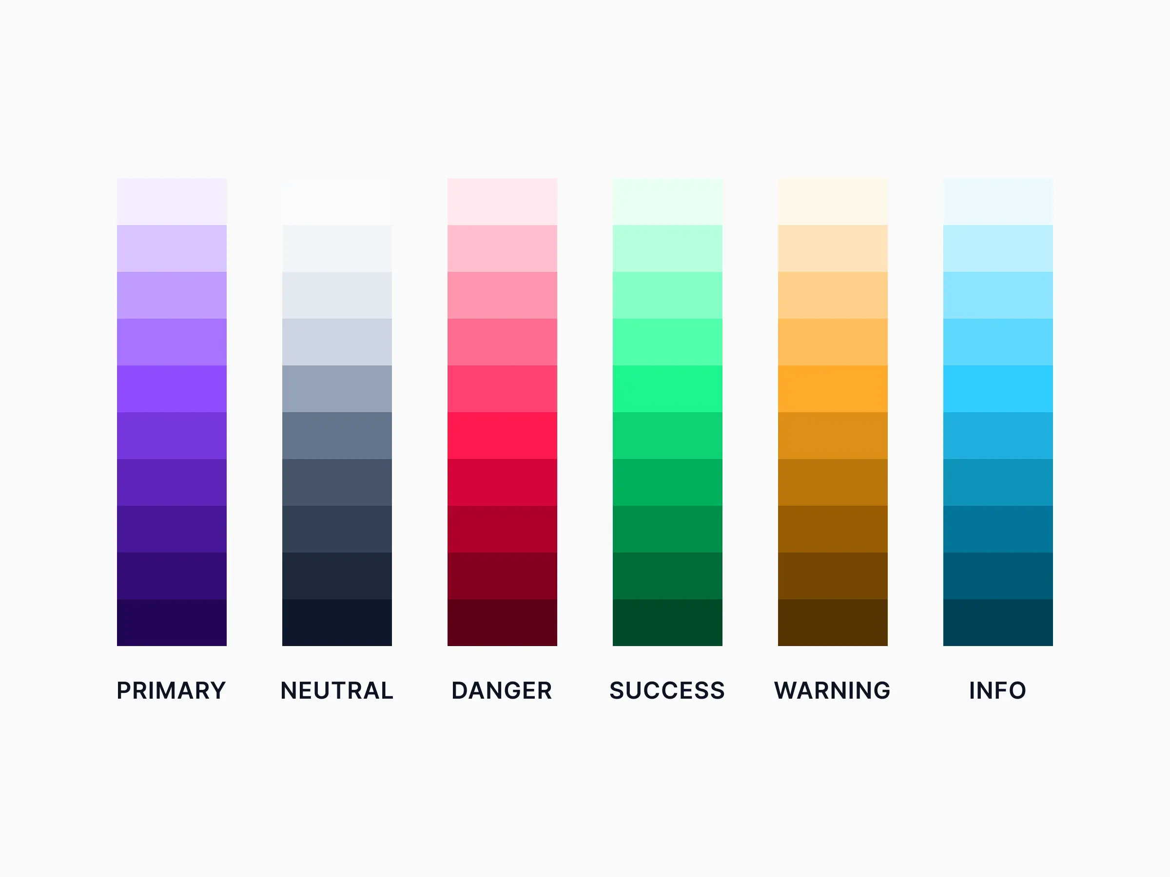 Example of generated colour ramps of primary, neutral and feedback colours
However this might not always be the best approach. These shades do not take into the account of the "use cases" where they would be used. Pre-defined colour shades might not have enough contrast which would accessibility problems. It is also possible that some colours only need and 2-3 and the other shades never get used. This applies to shades defined on a linear lightness curve or some more fancier curve.
So it is better to start out with fewer shades and evolve it as the design mature. In this article I will go over my approach to defining accessible colour shades that are guided by use cases.
10 shades of grey
In most product interfaces, neutrals (greys including white) make up most of the background surfaces, text, icons etc. So they play a very important role in the overall visual appreance of a product. (Wrong shade of a background surface can ruin a design.) When we use pre-defined shades of grey, finding enough accessible pairs of colours that look visually appealing becomes a challenge.
An accessible pair of colours is pair of foreground and background colours that have a contrast of 4.5:1 for AA rating (or 7:1 for AAA rating)
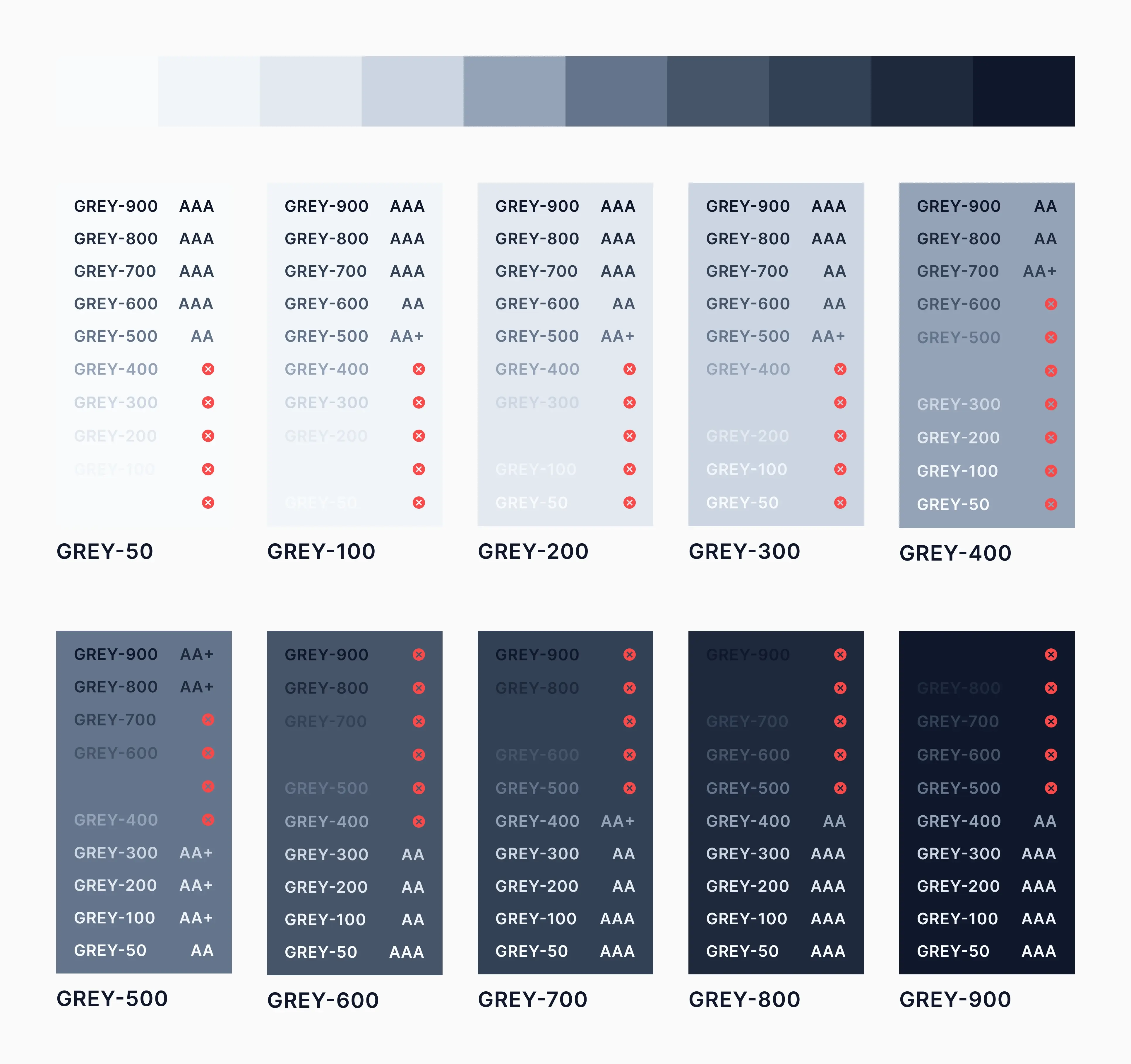 example contrast accessibility of generated shades of neutral grey
The approach I follow is to first figure out the use cases for my greys. A complete inventory of all the ui elements may not be necessary or possible in early stages. Even when designing something brand new, initial explorations plus a little planning could help inform this decision.
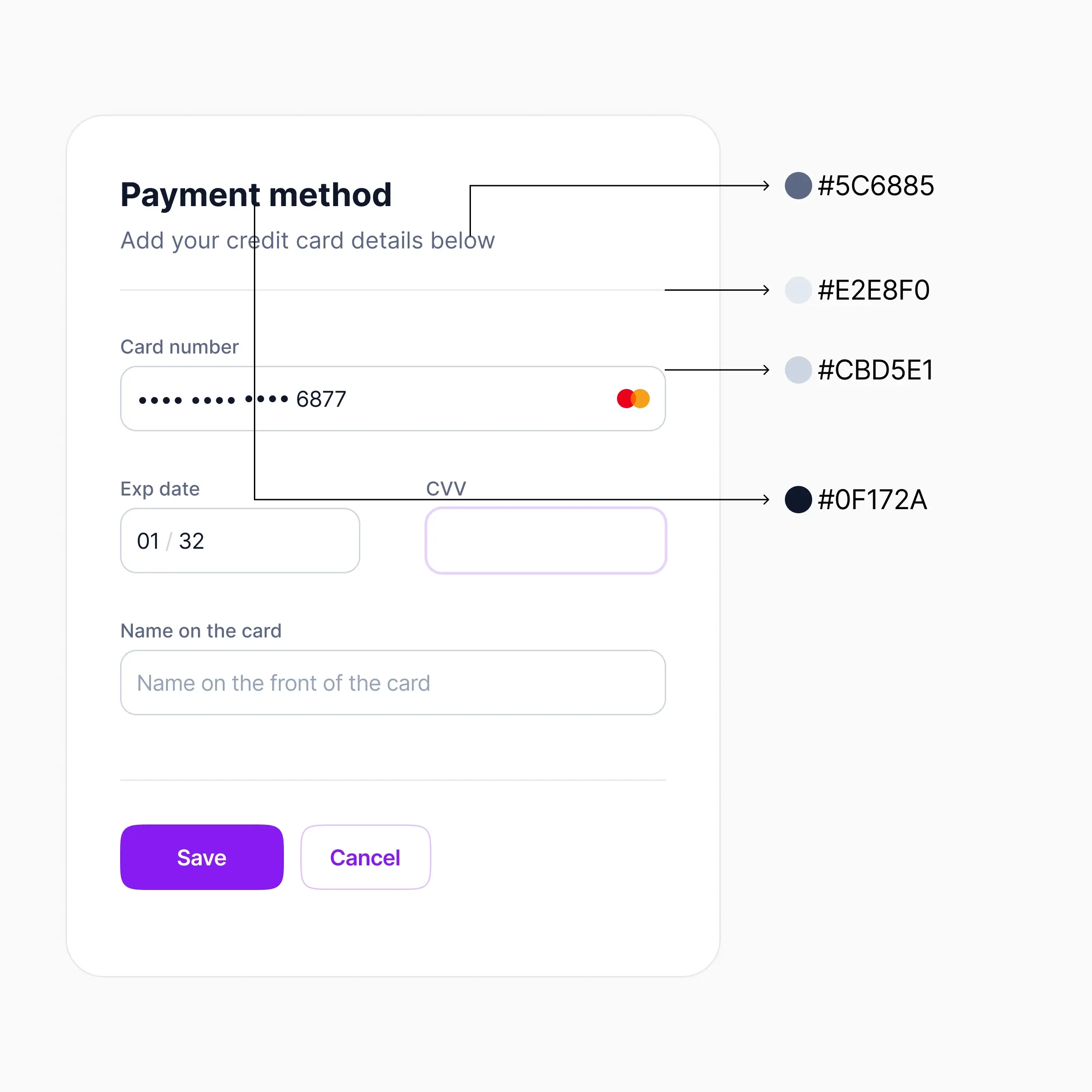 example of use cases of neutral shades
A typical design would need, a few shades of grey for background colours, a few shades of text, icons fills and maybe a few border greys. As you design more ui elements you would define new shades or tweak the existing one\es while documenting accessibility pairs for your team reference.
There is an inherent risk of defining too many shades in this approach, so it is important to consider already defining colours before add a new shade to the colour ramp.
Primary colours
In most designs out of the 8-10 shades of pre-defined primary colour, only a handful of these would be needed. For example primary and secondary buttons, text buttons, and other some input elements like progress bars. Typically these could be addressed by few shades of primary colour. However this should be determined by needs of the design.
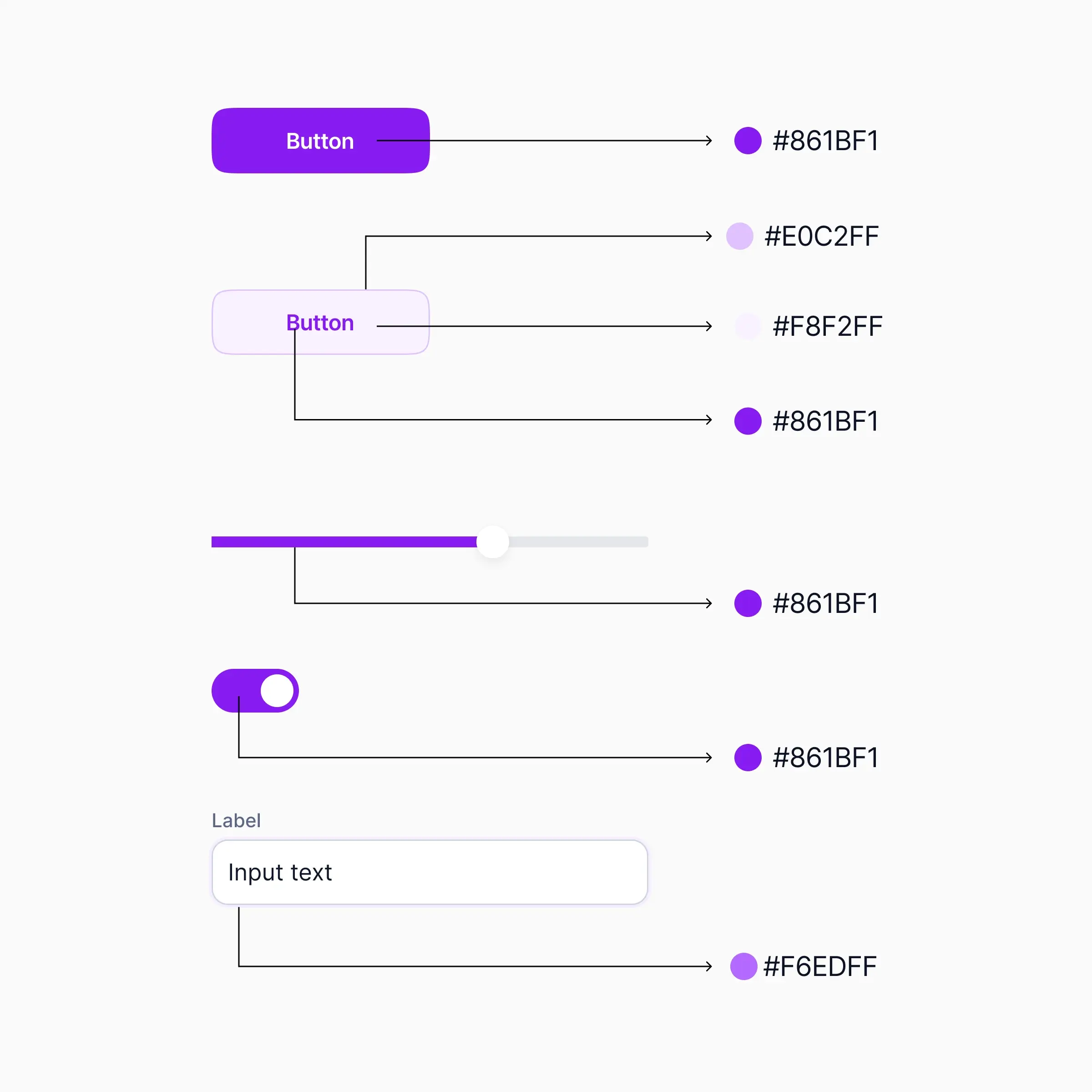 example uses of primary colour
Interactive states
An interactive state for elements such a button would have multiple states: default, hover, active, disabled etc. Instead of turning all of these into colour stops in your primary colour ramp, combine your primary colour with modifiers with semi-transparent #000000 or #ffffff to define these states. Tweak your modifiers and primary colours to make them accessible and document these accessible pairs
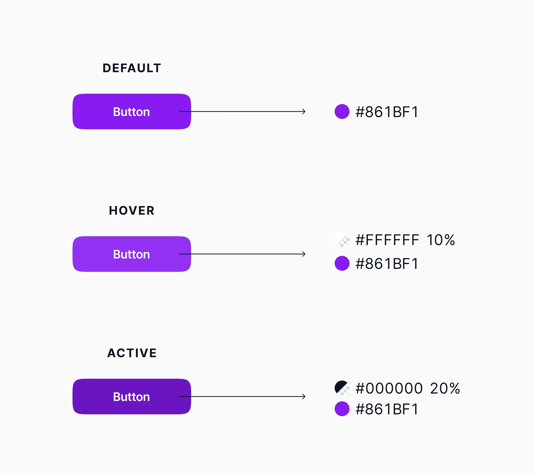 Hover and active interactive stated created using modifiers
While this method is slightly more complicated than just defining interactive states, separating out modifiers keeps the colour ramp simple and manageable.
Feedback colours
Feedback colours are colours used to communicate information, success, warnings, danger statuses. While almost all designs require these statuses, how and where feedback colours are used would vary greatly from product to product. However similar to primary colours, feedback colours might require only a few shades, maybe even fewer.
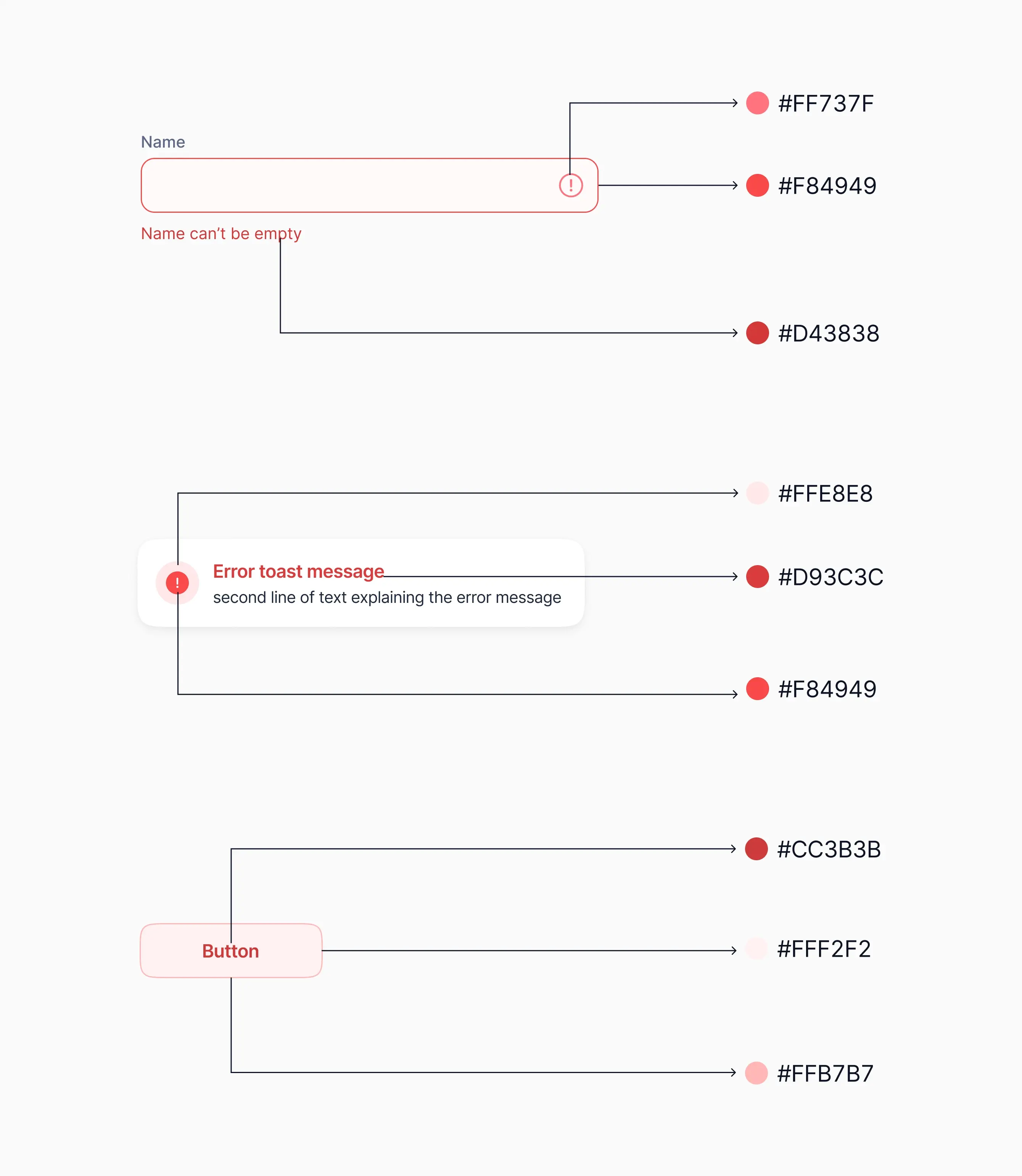 Some examples of use of shades of danger status colour
Naming colours
When defining colour shades based on use cases, naming them using a typical 100-900 system might cause some confusion. More likely than not we would have to add "middle shades". For example if we define HSL(210,40,98) as grey-100 and HSL(214, 32%, 91%) as grey-200 and later want to add HSL(210, 40%, 96%) to our grey colour ramp, then we would have clunkily name it something like grey-150 which would be very arbitrary.
Instead, a better approach would be name them based on lightness. This allows the flexibility of adding and removing colour shades while keeping their names meaningful. I learned this from this article by Nathan Curtis.
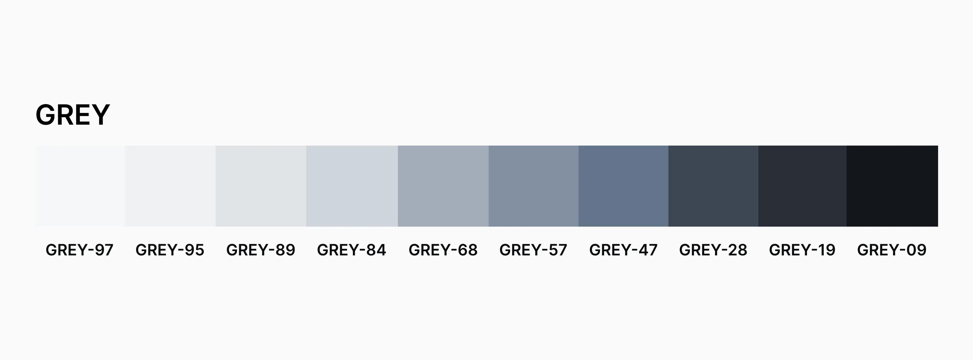 Shades of grey named according to HSL lightness.
Conclusion
Starting with a small set of colour based use cased and docuementing it during the early stages of a design would serve as a strong foundation that could evolve as the design scales.