 3 / S C
As a design studio we work with many clients across various domains. Each client has unique use cases and unique visual design problems to solve. The atomic components that make the interfaces i.e. form fields, buttons modals etc. have their distinct visual style but the underlying structure is quite similar. We were spending significant amount of time on each project just recreating these components in Figma for each project.
When we came across Headless Design Systems video the idea of creating a core set of components that could be themed across all our projects seemed like the obvious step to use our time more efficiently. Once Figma introduced variables, we decided to start building our own UI-kit.
Why we didn’t start with a public UI-kit/Design System
While starting on a public design system might initially seem like a great idea to save time, they come with tradeoffs that might end up causing issues. Each design dystem or UI-kit is built on a set of architectural decisions and principles. For instance, Material Design is an expertly built and documented design system but the main principles are geared towards Android and Google products.
Even general purpose UI-kits and design systems come with their own problems. These tend to try to address really broad use cases which result in too many components and styles. As these libraries are huge we learned from our past experiences that forking one of these to use as our base would require a lot of effort to make even small changes.
Our workflow and architecture
Right from the start, we were very clear that our components should stay unopinionated because we need them to be easily themable, extensible and easy to use. We use inputs, buttons, etc in almost every project so we started with them. Other components like modals, drop-downs are built with slots to customise them as needed for each project. Rather than building separate auto-complete and date-picker component, we built these as sub-components that could replace an empty slot in a dropdown component.
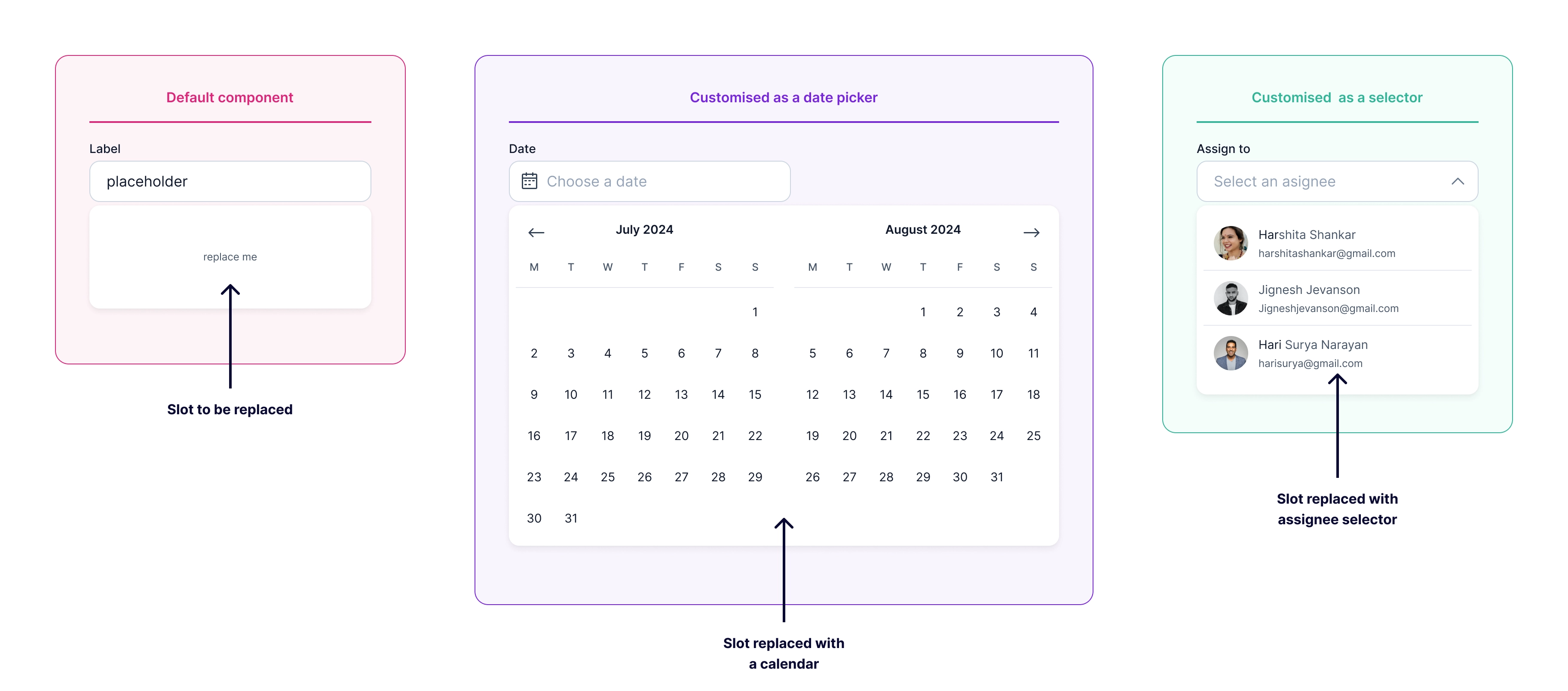 Dropdown configured as date picker and selector
Workflow
The workflow we decided follow was to use a duplicate of this core component library in each project. This duplicated library would be customised to suit the visual language of the project. Project-specific components are added and maintained within this library. We chose this approach because it would allow the component library for each project to exist independently. Our core library would also remain simple and we can evolve it without worrying how it would impact project specific libraries. At the end of each project we want to take the learnings to our core library. These could be new components or improvements to existing components.
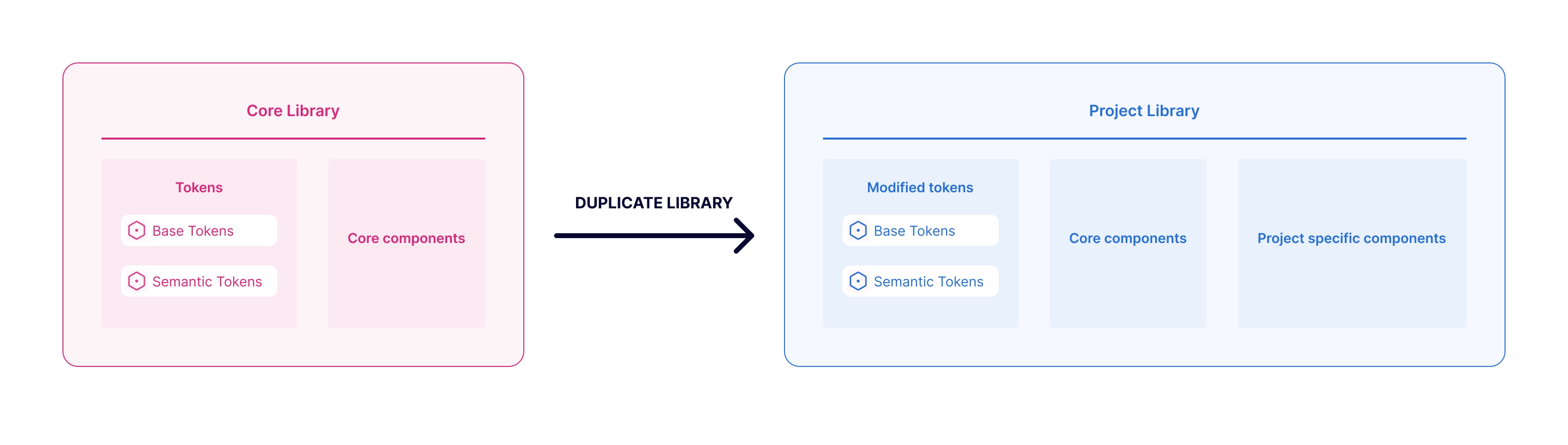 Our workflow for using design library across different projects
Token architecture
Our variables architecture is rather simple. We just use two levels of our variables Primitive (variables that store raw values like grey-100 to grey-800) and Semantic (variables that are purpose-driven, for example bg-primary, text-error etc). We use modifier variables for interactive states (like hover, focus etc). We chose not to add any component level variables as we don’t see any immediate advantages that would justify the additional complexity. Once Figma supports typography tokens we want to figure out if we could use modes for sizes but for now we use variants for different sizes.
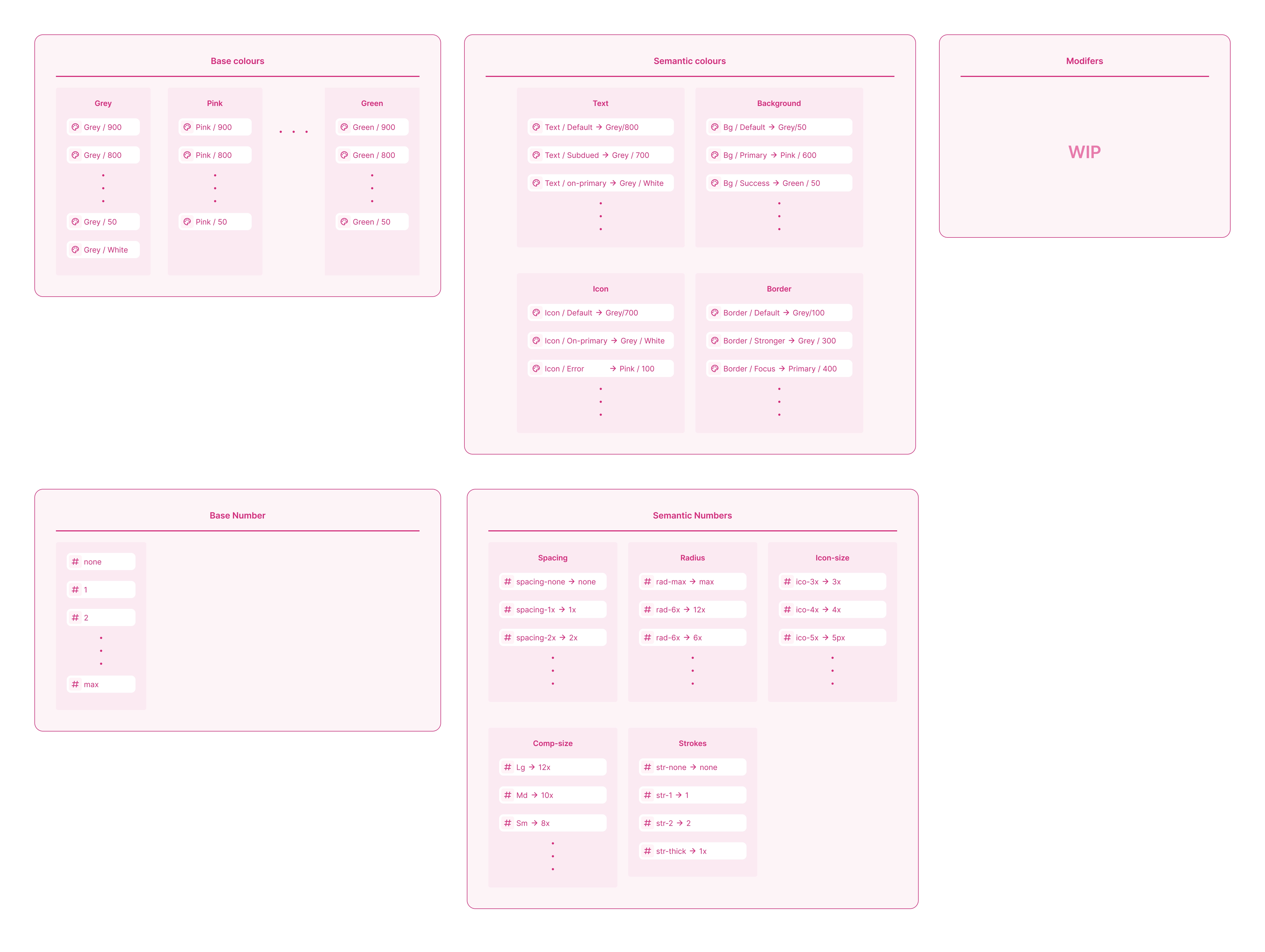 Our updated token architecture
Learnings from using it in a project
When we started using this workflow in a project we were immediately overjoyed. We were able to very quickly and easily customise the library. This validated our approach. However, we also learned that there were changes and improvements we needed to make.
We found our semantic number variables were not intuitive. We used t-shirt sizes for spacing, radius, sizing etc but it caused confusion because Sm, Md, Lg in radius were different for Sm, Md, and Lg for spacing. Therefore, it was not immeditely obvious which variable to use if someone wanted to add 8px of spacing. We wanted to use multiplier-based naming convention i.e. use radius-3x, spacing-2x etc. This approach would help us avoid any confusion while giving us the flexibility to switch between 4px, 5px or any other grid system if needed. We also realised that we could simplify our current architecture.
We had two versions for some of our components like inputs - a simple one that would work in most use cases and a more complex one that is completely configurable. We went with the approach because we wanted to make it easy for the consumer (the team using these components). However we realised that this was not adding enough value to justify the additional effort required in theming and maintaining two versions.
Future
Along the making the improvements we mentioned above we plan to work on documentation and share our UI-kit publicly. As we built it to be small, themable and unopinionated, we hope that others might find it to be a useful base to build their own libraries. We published search component on Figma community to showcase our approach as we are polishing the rest of the library. Please take a look and share your feedback.